


When it comes to interior design, color can make or break a space. Just as fashion trends evolve, so do color trends in home decor. And while some colors remain timeless, others quickly become dated and out of style. If you’re planning a home makeover, it’s important to stay ahead of the curve. Based on the insights from leading design experts, here are thirteen paint colors that have overstayed their welcome. It’s time to rethink these shades for a fresher, more modern aesthetic.
1. Millennial Pink: The Overused Favorite

Introduced as a refreshing alternative to the standard pinks, Millennial Pink quickly gained popularity for its subtle, sophisticated hue. However, its overuse in recent years has left many designers craving a change. This color has been a go-to for everything from wall paint to furniture, making spaces look more monotonous than chic. While it’s not bad to have a touch of Millennial Pink, using it as the main color scheme can make your space feel dated. Instead, explore shades like Benjamin Moore’s Color of the Year for 2025 for a modern twist.
2. Basic Beige: Too Safe and Too Bland

/ Esty
Beige has long been a staple for those seeking a neutral, calming palette. However, its prevalence has resulted in many spaces looking uninspired and bland. Not to mention, beige can sometimes come off as muddy, especially in rooms with limited natural light. Instead, designers are recommending off-whites and light grays as a more contemporary and versatile base.
3. Ultra Pure White: A Sterile Environment

While white is timeless and can create a sense of spaciousness, Ultra Pure White can often make a room feel cold and sterile. This extreme shade of white doesn’t bring much character to a space and can be rather unforgiving, showing up every little mark and scuff. Instead, opt for softer shades of white with warm undertones to bring a cozy, inviting feel to your room.
4. Mustard Yellow: A Tiresome Trend

Mustard Yellow, once a hip and trendy color, has now become a tiresome trend. Its intense, saturated hue can be overwhelming, and it doesn’t play well with many other colors. Instead, consider earthy yellows or muted gold tones that offer warmth without overwhelming the eyes.
5. Lime Green: An Overwhelming Option


Lime Green took the design world by storm a few years back, making a bold statement in any space. However, its vibrancy can be too overwhelming and hard to match with other colors. Instead of Lime Green, consider a more muted green tone. Sage green, for instance, is a popular choice for its calming and grounding properties.
6. Neon Colors: Too Loud for Comfort


Neon colors, while fun and exciting, can often be too jarring for a living space. These intense hues can create a chaotic environment, making it hard to relax. If you’re looking for a pop of color, consider pastel hues or jewel tones that are vibrant yet soothing.
7. Lavender: A Passing Fad

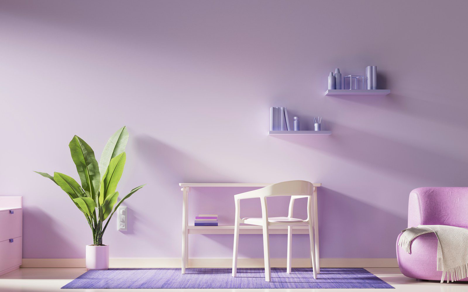
Lavender had its moment of glory, but designers say this pastel shade is a passing fad. While it can bring a calming effect, its soft, cool tone can also make a room feel cold and uninviting. If you love purple, consider a warmer, deeper shade like plum or grape.
8. Pumpkin Spice: More Than Just a Seasonal Latte

A seasonal favorite in the form of a latte, Pumpkin Spice has also made its way into our homes. However, its intense shade can feel too autumny and kitschy if overused. Instead, opt for subtler, warmer shades of orange that can evoke a cozy vibe all year round.
9. Baby Blue: An Outdated Nursery Classic
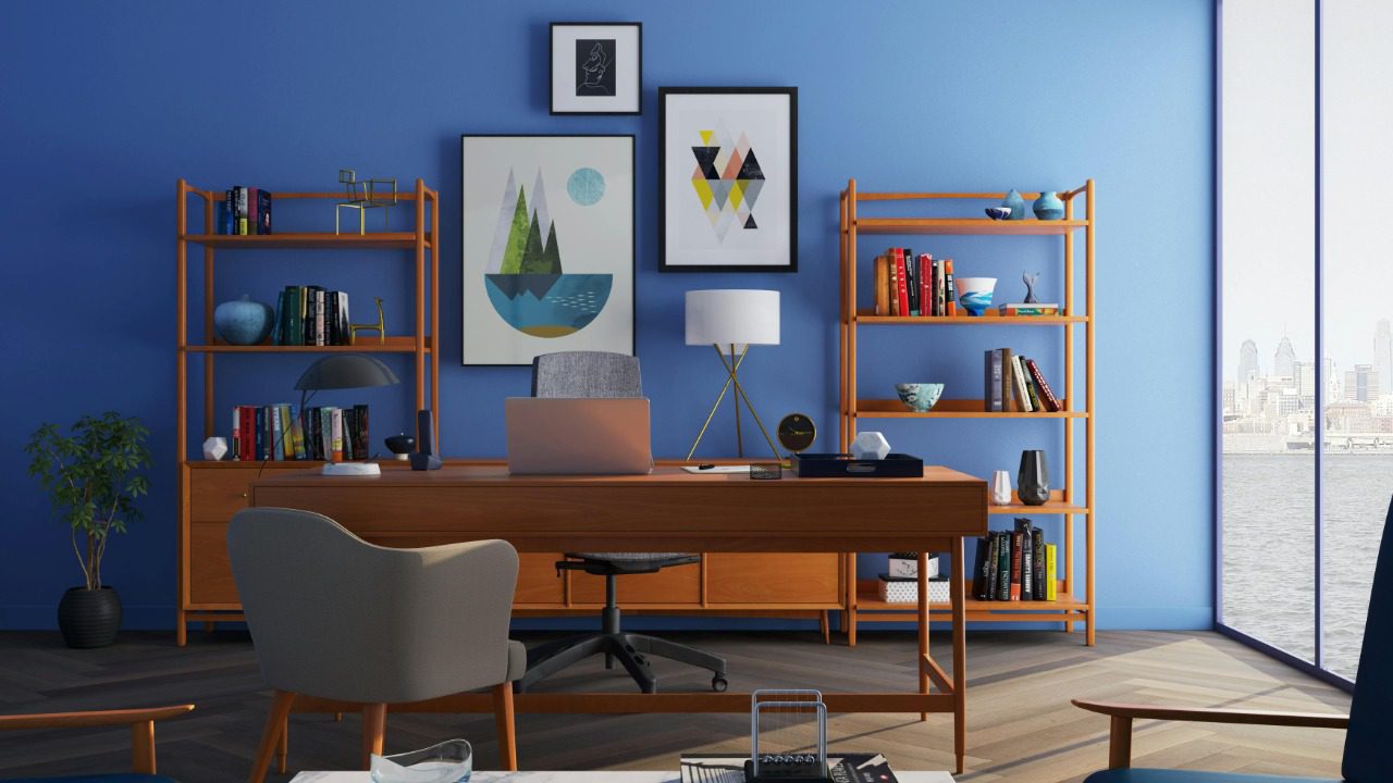
Baby Blue has long been a classic choice for nurseries, but its soft, sugary shade can feel a bit outdated in other spaces. Instead, designers recommend exploring other shades of blue. A rich navy or a serene teal can bring a sophisticated and contemporary vibe to your space. Check out Pinterest’s 2025 color palette for inspiration.
10. Eggplant Purple: A Dark, Depressing Hue

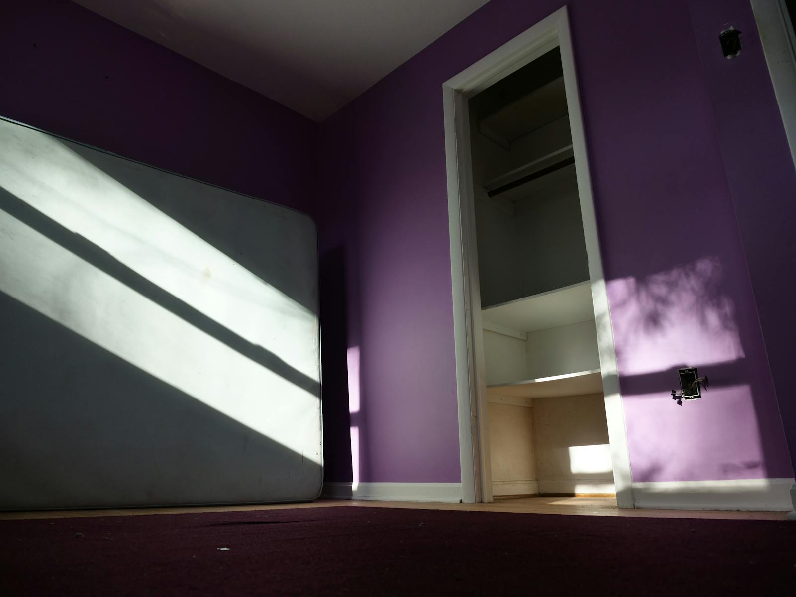
While Eggplant Purple can add a dramatic touch, its deep, dark hue can also make a room feel closed in and depressive. Designers suggest using this color sparingly, if at all. Instead, lighter and brighter purples can add a touch of luxury and warmth without the gloom.
11. “Greige”: The Gray-Beige Hybrid
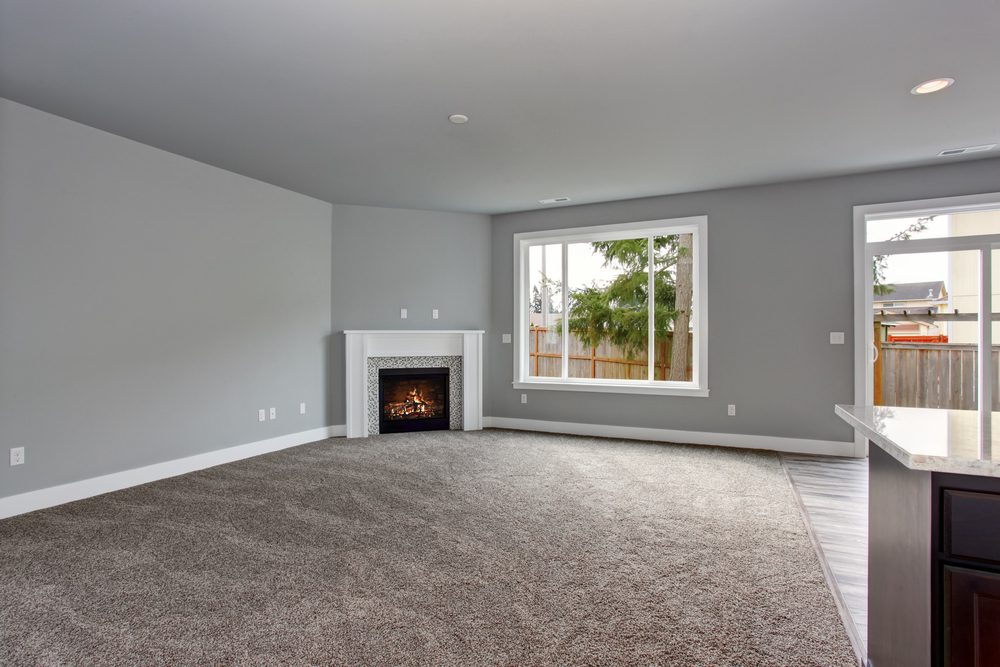
‘Greige’, a blend of gray and beige, had a moment in the spotlight. However, its muted tone can sometimes feel dull and lifeless. Designers recommend adding in pops of color to prevent a greige-dominated room from looking too monotone. Better yet, ditch greige altogether and embrace a more vibrant palette. Have a look at Better Homes and Gardens’ ins and outs for 2025 to get ideas.
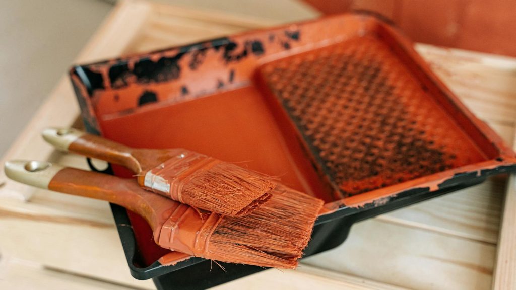
12. Chocolate Brown: A Heavy, Saturated Shade

Chocolate Brown, while rich and cozy, can make a room feel heavy and oppressive if used excessively. Its dark tone absorbs light, making a space seem smaller and gloomier. Instead of Chocolate Brown, consider lighter, warmer browns or even terracotta shades for a brighter, more welcoming space.
13. Candy-Apple Red: Bold but Brash

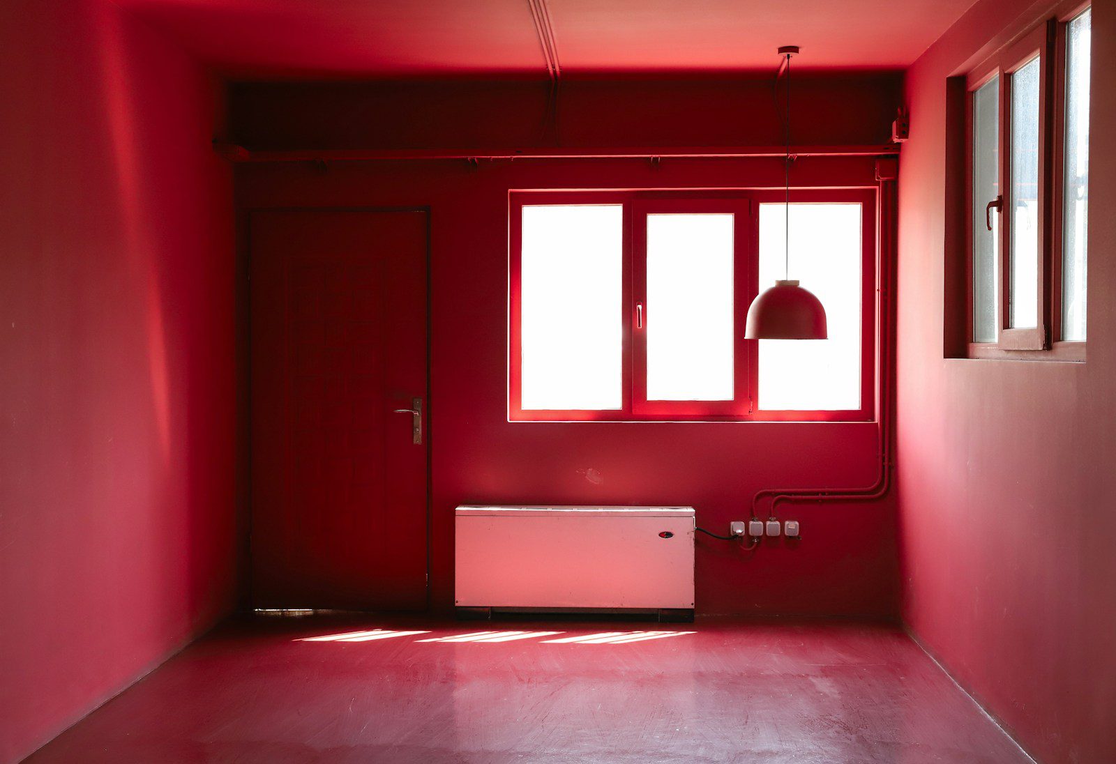
Candy-Apple Red, with its bold and energetic vibe, can be an attention grabber. However, its intensity can be too much for the eyes and can easily dominate a room. If you’re a fan of red, consider more subdued shades like burgundy or rust for a classy and timeless look. For more ideas on what colors are trending, visit this list of vintage paint colors that are making a comeback.