


When it comes to selling your home, the aesthetic appeal is a significant factor. One aspect that potential buyers will notice immediately is the color scheme of your home. While you may adore your bold, unique color choices, they may not appeal to a broad market, potentially lowering your home’s resale value.
Let’s dive into eight surprising colors that could negatively impact your home’s value. By being aware of these shades, you can make informed decisions about your home’s decor, ensuring that your space remains appealing to potential buyers while still reflecting your personal style.
1. Bright Red


Red is a bold, vibrant color, often associated with passion and energy. While a bright red room might seem exciting and lively, it can be overwhelming for potential buyers. The intensity of the color can make spaces seem smaller and less inviting, which could deter buyers who prefer more neutral tones or minimalist designs.
Instead of going all out with bright red, consider using it as an accent color. A few tastefully chosen red items can provide a pop of color without overwhelming the space. Alternatively, you could opt for a more muted shade, like a deep burgundy, which may be more appealing to a wider audience.
2. Neon Colors

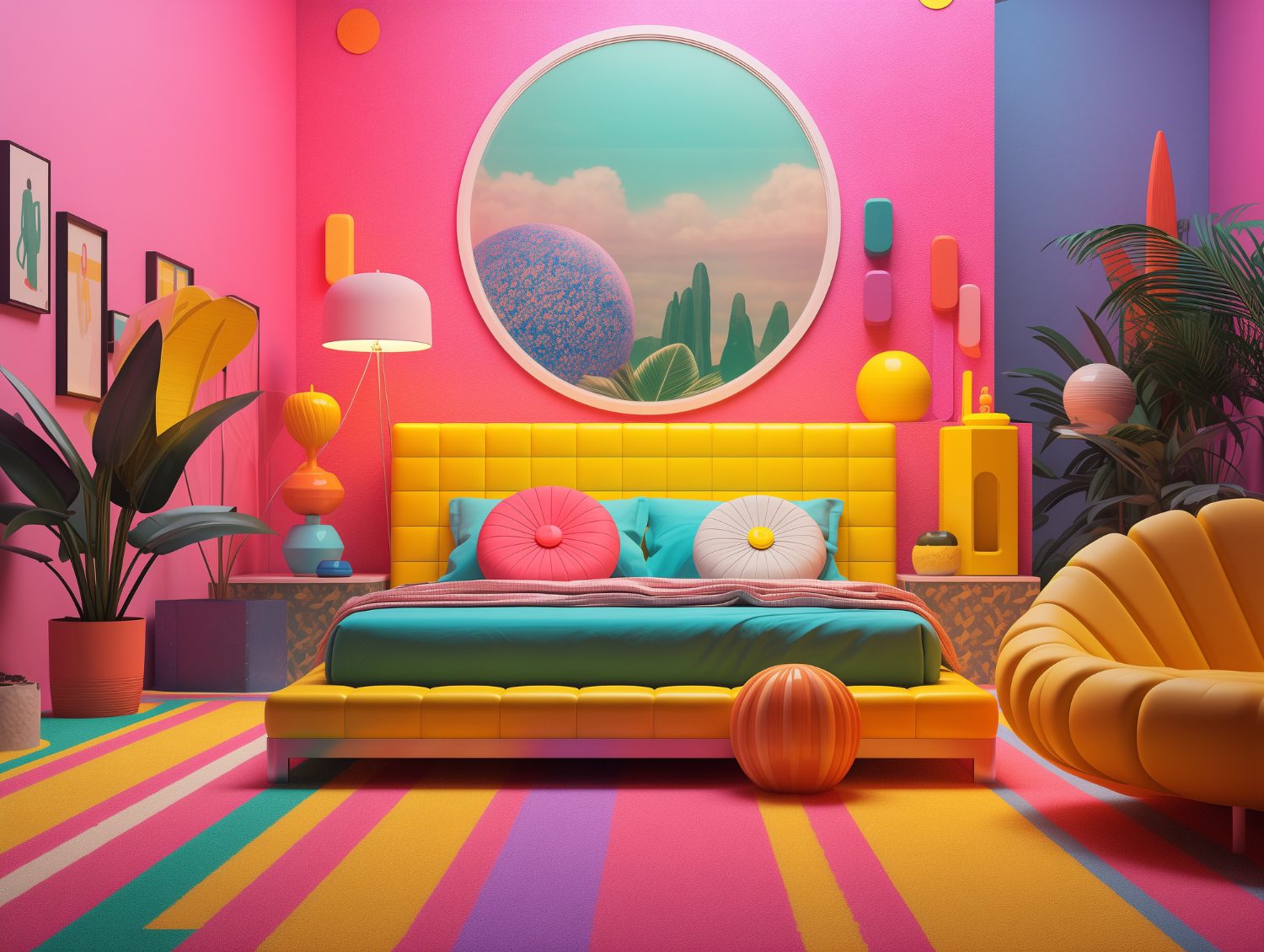
Neon colors might seem fun and trendy, but they’re not necessarily the best choice for home decor when considering resale value. The brightness and vibrancy of neon colors can be off-putting to potential buyers, making your home less appealing. A house with neon-colored rooms might come across as too personalized, deterring buyers who would have to spend time and money repainting.
Instead, consider using neon colors sparingly as accents or in smaller, less prominent spaces like a child’s bedroom or playroom. This way, you can still enjoy these bright, playful hues without negatively impacting your home’s value.
3. Dark Brown

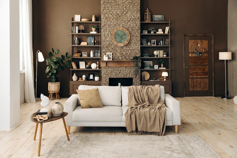
While earthy, warm colors can make a home feel cozy and inviting, dark brown is one color that can lower your home’s value. It can make rooms feel smaller and more closed off, which isn’t conducive to creating an open, welcoming space that buyers look for.
Instead of covering entire rooms in dark brown, consider using this color for furniture or accents. If you’re set on using brown as a wall color, opt for a lighter, more neutral shade. This will help to keep the space feeling open and inviting while still offering a hint of warmth and comfort.
4. Bright Yellow

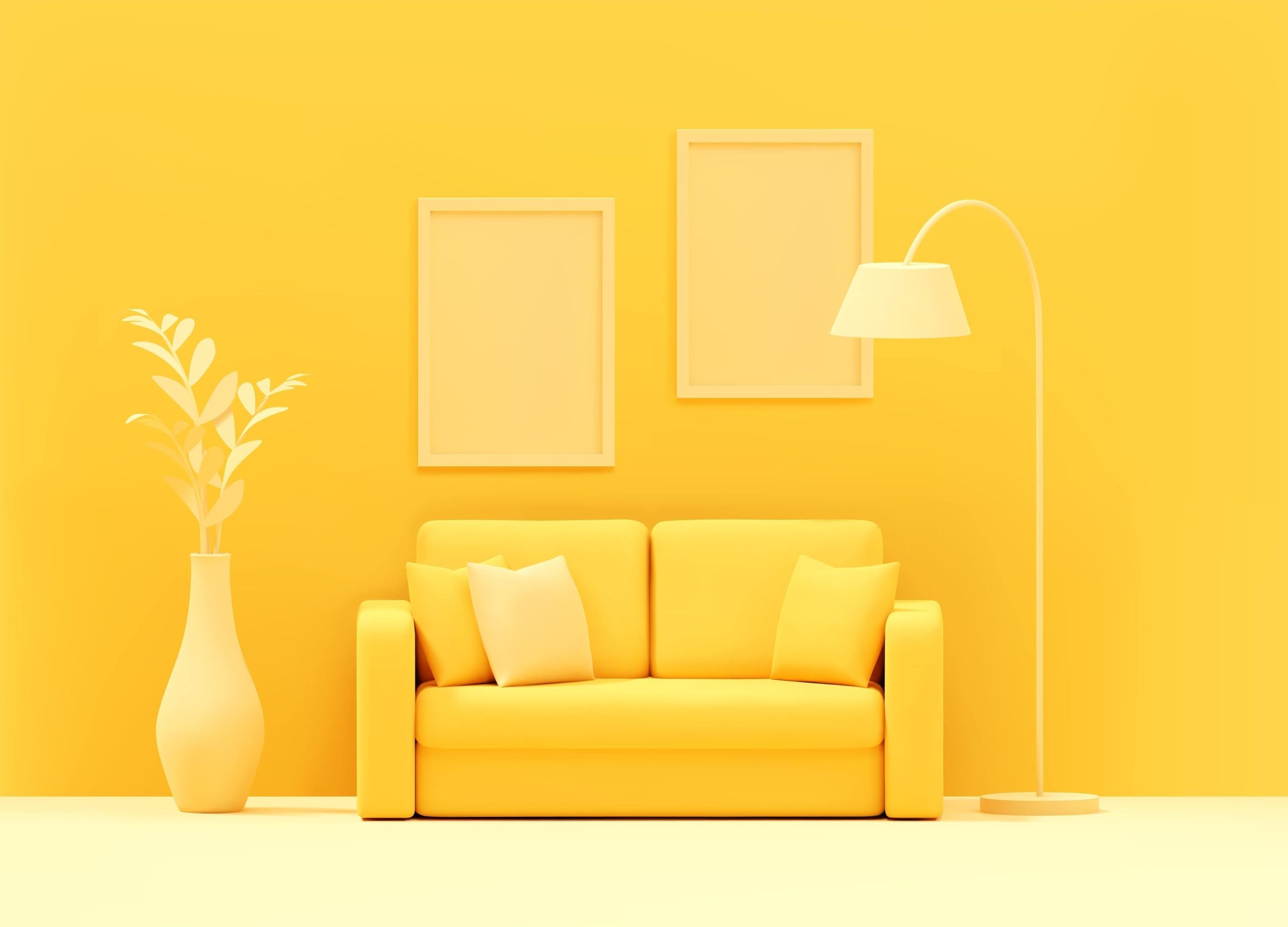
While yellow is often associated with happiness and energy, bright yellow can be too intense for many buyers. A room painted in a bright yellow shade can feel overwhelming and even cause discomfort due to its intensity. This could potentially turn off buyers and lower the value of your home.
Instead of bright yellow, consider using a softer, more muted shade. Pale yellows can be comforting and inviting, offering a touch of color without being too overpowering. This can help to create a pleasant atmosphere that appeals to a wide range of potential buyers.
5. Black
Black can be a sleek and modern color choice, but it’s also a risky one when it comes to home decor. Dark colors like black can make a room feel smaller and more closed off. Additionally, black rooms can be challenging to repaint, which could deter potential buyers.
Instead of painting entire rooms black, consider using black for accents or furniture. This can add a touch of elegance and modernity without making the room feel too dark or confined. If you do want to use black on your walls, consider doing so in a smaller space, like a powder room, for a dramatic effect.
6. Orange
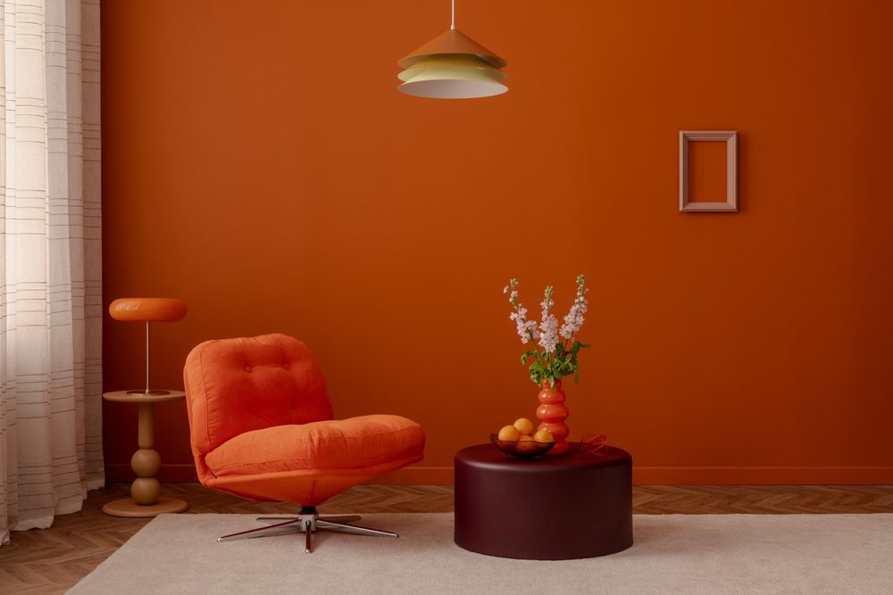
While orange can bring a burst of energy and vibrancy, it’s a color that tends to polarize people. Some love it, while others find it too intense and stimulating. Because of this, orange might not be the best choice when trying to appeal to a broad range of potential buyers.
If you love orange, consider using it sparingly as an accent color. Alternatively, you could opt for a softer, more muted shade of orange, like a peach or coral. These colors can offer a hint of warmth and energy without being too overwhelming.
7. Lime Green
Lime green can be a fun and lively color, but it’s not always the best choice for home decor. Like other bright, intense colors, lime green can be overwhelming and off-putting to potential buyers. Additionally, it can be challenging to match with other colors, making it harder for buyers to envision their furniture and decor in the space.
Instead of painting entire rooms lime green, consider using it sparingly as an accent color. You could also opt for a more muted shade of green, which can offer a touch of nature and tranquility without being too bold or intense.
8. Purple
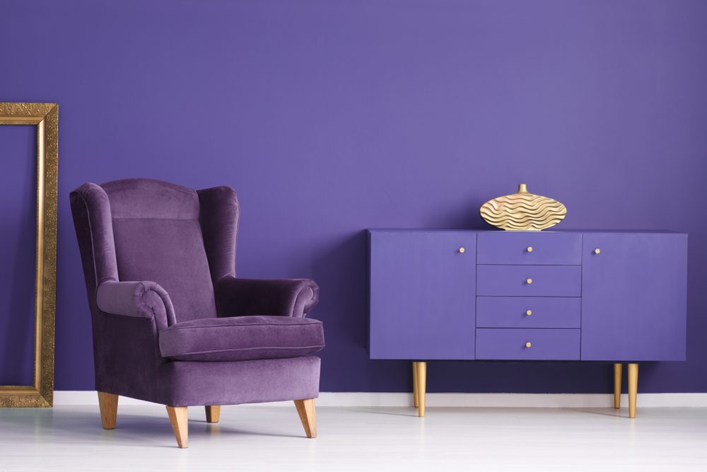
Purple is often associated with luxury and royalty, but it’s a color that can be quite polarizing. Some people love it, while others find it too intense or feminine. Because of this, using a lot of purple in your home decor can potentially lower your home’s value.
Instead of using intense shades of purple, consider using lighter, more muted shades, like lavender or lilac. These softer hues can add a touch of elegance and tranquility without being too overwhelming. If you prefer darker purples, consider using them sparingly as accents to add depth and richness to your decor.