Picking paint colors can feel exciting, but it’s easy to end up with a shade that doesn’t sit right after a few weeks. Sometimes what looks good in the store or in photos just doesn’t work in your actual space.
Knowing which colors tend to cause regret soon after painting can save you time, money, and frustration. This guide will help you avoid the most common pitfalls so you can paint with confidence.
Bright Red: Too bold and tiring for most spaces
If you choose bright red for your walls, be ready for a lot of attention. It’s a bold color that can feel overwhelming in everyday living spaces.
Bright red can be tiring because it’s so intense. You might find it hard to relax or focus when surrounded by this color.
For most rooms, a more muted or warmer red shade can be easier to live with. Bright red works better as an accent than a full wall color.
Dark Purple: Can make rooms feel gloomy fast
Dark purple might seem like a bold, elegant choice at first. But be careful—this color can quickly make your space feel smaller and darker.
If your room doesn’t get much natural light, dark purple can amplify that gloominess. It’s a color that demands balance and good lighting, or it risks turning your room heavy rather than cozy.
You might love the idea of deep, rich tones, but if you want your space to feel bright and open, dark purple could become a paint regret sooner than you think.
Neon Green: Hard to match with anything else
If you choose neon green for your walls, be ready for a challenge. It’s a super bright color that can easily overwhelm a room if you’re not careful.
Neon green works best as an accent, not a main color. Using it everywhere might make your space feel a bit too intense and hard to live with.
You’ll want to pair it with cooler tones like blues or purples to balance its energy. Otherwise, finding colors that don’t clash can become tricky fast.
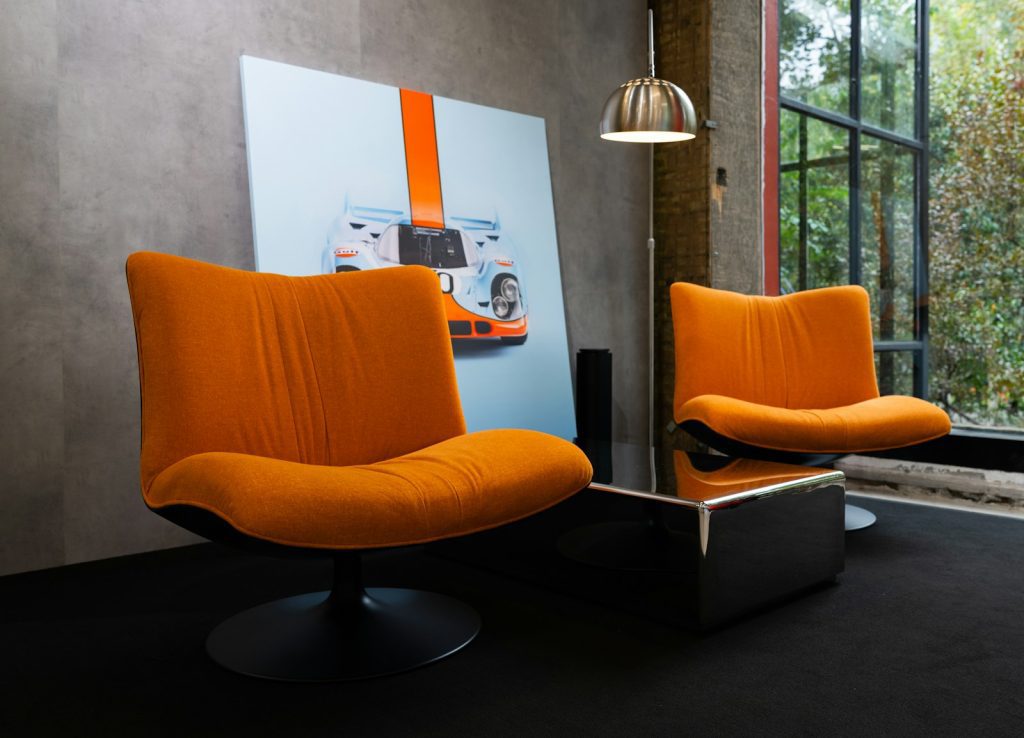
Bright Orange: Often overwhelms the eye quickly
Bright orange can feel really exciting at first, but it’s easy to burn out on. You might notice it becoming too intense after only a few weeks.
This color grabs attention, but it can dominate a room and make it hard to relax. If you’re not careful, it can make your space feel cramped or chaotic.
Unless you pair it thoughtfully with softer tones, bright orange can be a bit much. It’s usually better for small accent walls or details rather than entire rooms.
Intense Black: Feels too heavy when overused
Using black paint can look sleek and modern, but if you cover a lot of your space with it, things can start to feel really heavy. It might make your room seem smaller or darker than you expected.
Black works great for accents like doors or cabinets, but painting entire walls or big areas might leave you feeling a bit overwhelmed. If you love black, try mixing it with lighter colors to balance the weight and keep your space inviting.
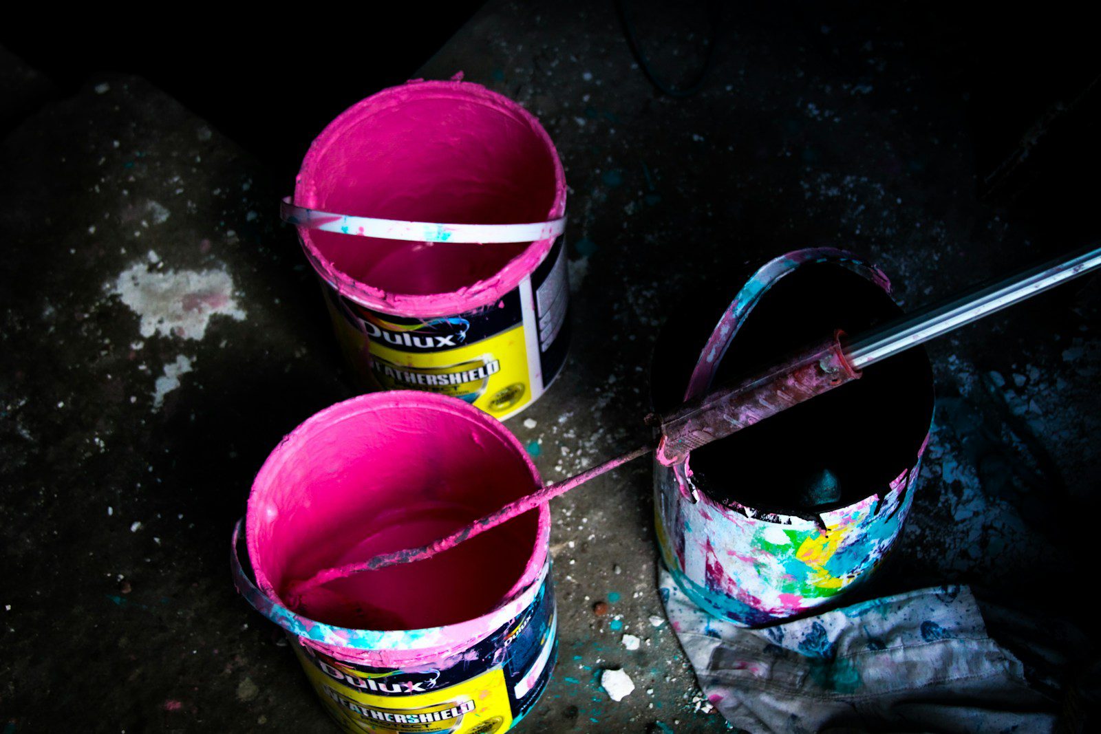
Hot Pink: Tends to look dated in no time
If you’re thinking about bold hot pink for your walls, be careful. It can feel fresh at first but quickly starts to look tied to a specific time period.
This shade often overwhelms a space and limits your decorating options. It’s a color that can easily clash with furniture and finishes, which makes it tricky to keep stylish.
Instead, consider more muted or soft pinks that add warmth without shouting. These are easier to live with and less likely to feel outdated fast.

