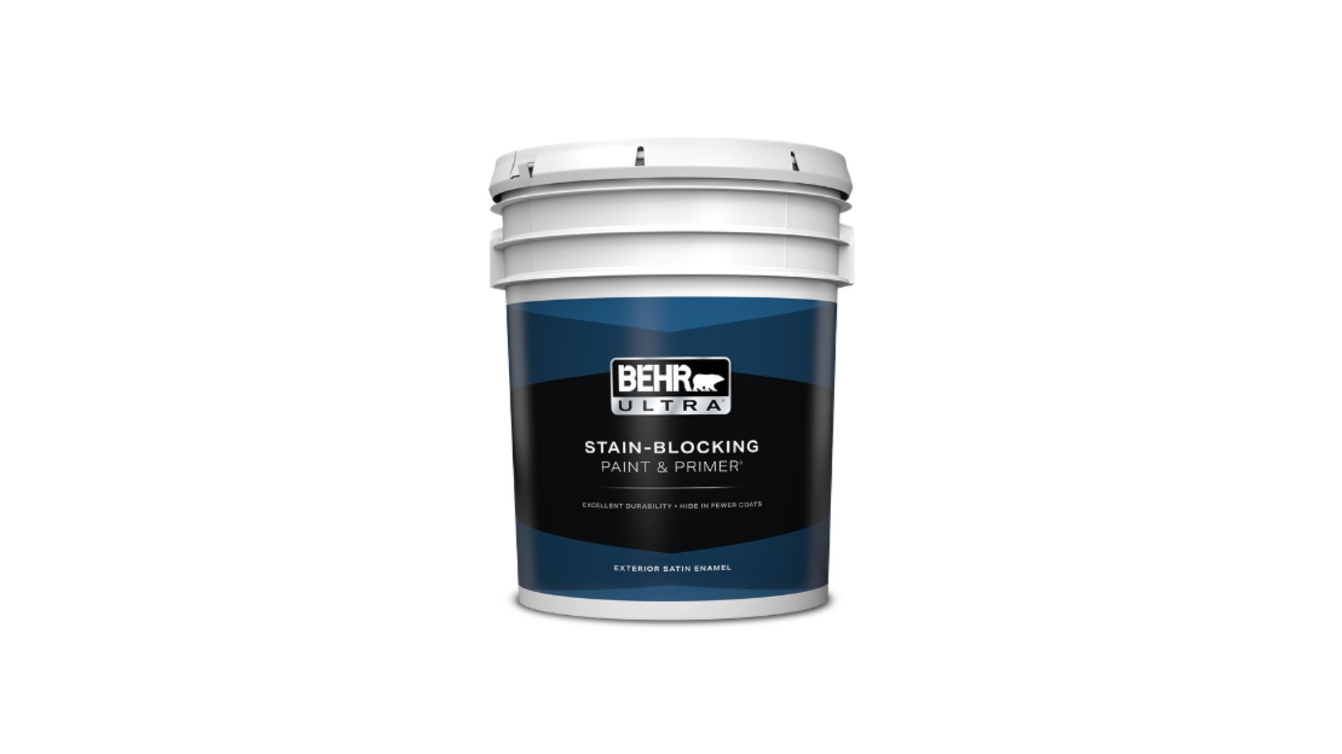
Behr has named “Grounded” its official 2027 Color of the Year, according to the company’s own announcement, and the pick continues a run of muted, low-saturation neutrals that has defined the brand’s top color for several years running. Grounded is a warm, deep neutral built around earthy undertones rather than a bold, attention-grabbing hue — the kind of paint that reads as a backdrop and a mood at once. It arrives in the same restrained lane that produced 2024’s near-black Cracked Pepper and 2025’s dusty, mauve-toned Rumors, and that repetition is the real story. Four years running, the biggest paint brand in the country has picked a color built to recede rather than announce itself, and that’s not happening by accident.
What “Grounded” Actually Looks Like
The name does most of the work here. Grounded sits in the warm-neutral family — closer to a soft clay or taupe-brown than a true gray — the type of shade paint brands increasingly favor because it shifts personality depending on lighting and what’s paired with it. Under warm bulbs it can lean toward brown; against cooler daylight it flattens into something closer to stone. That flexibility is a selling point in itself: a single gallon reads differently in a north-facing bedroom than it does in a sun-flooded kitchen, which is part of why brands keep landing on colors like it rather than something more fixed and saturated.
Four Years of the Same Instinct
Grounded’s predecessors tell a consistent story. Cracked Pepper, the 2024 pick, was a near-black warm neutral that worked as an accent wall or a full-room statement without reading as trendy. Rumors, chosen for 2025, pulled in the opposite direction with a dusty, quiet mauve that still avoided anything close to bright or saturated. Both, like Grounded, were built to last through a redesign cycle rather than announce a single year’s trend. Behr isn’t alone in that instinct — competing paint brands have leaned the same direction in their own recent picks — but four consecutive years of muted, nature-adjacent neutrals from the industry’s largest player is enough to call it a pattern rather than a coincidence.
Why Paint Brands Keep Playing It Safe
Part of the answer is economic. Homeowners are repainting less often than they did a decade ago, which means a color has to earn its place for longer before someone replaces it. A saturated, of-the-moment shade risks looking dated within a few years; a muted neutral built around brown, clay, or stone undertones tends to hold up through several style cycles and multiple owners. That matters directly for resale, where real estate agents have long steered sellers toward neutral palettes precisely because they don’t alienate a buyer’s taste. A paint company’s Color of the Year functions as much as a hedge against buyer’s remorse as it does a design statement.
How the Industry Actually Picks These Colors
A Color of the Year isn’t chosen the way a homeowner picks a paint chip off a wall display. Major paint brands, Behr included, run the process through trend forecasting teams that track design fairs, fashion runways, furniture releases, and shifts in what’s selling in flooring and fabric a year or two out, then narrow thousands of formulated shades down to one. Behr isn’t the only company running this exercise — Sherwin-Williams, Benjamin Moore, PPG, and several others each publish their own annual pick, usually within weeks of each other, and in years when the muted-neutral instinct is strong across the category, it tends to show up in more than one brand’s announcement at once rather than just Behr’s.
How It Plays in a Real Room
Grounded’s earthy base makes it a natural match for warm wood tones — white oak, walnut, rattan — and for brass or matte-black hardware rather than polished chrome. It works as a full kitchen cabinet color, a living room accent wall, or a whole-house neutral in homes leaning into the current preference for warm minimalism over the cooler grays that dominated the 2010s. Because it’s built to recede rather than lead, it also pairs easily with bolder accent choices elsewhere in a room — a patterned textile, greenery, or a single piece of statement furniture — without the wall color competing for attention.
What Grounded really confirms is less about 2027 specifically and more about where the entire category has settled: paint companies are no longer chasing bold, headline-grabbing colors for their flagship pick, because the audience buying paint by the gallon isn’t shopping for a statement. They’re shopping for a wall that still looks right in five years, which is a very different design brief than it was a decade ago.