


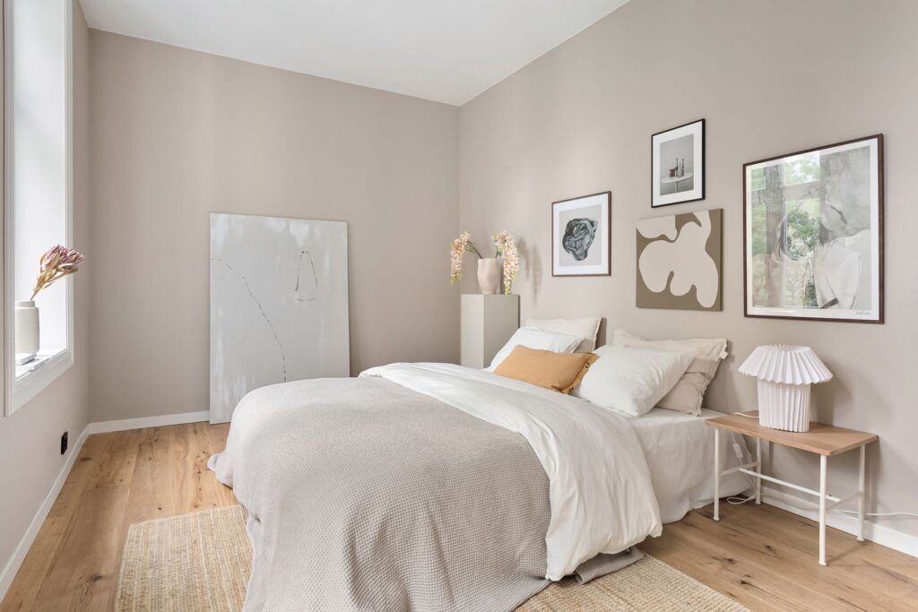
Millennial gray is losing its grip on American living rooms. In its place: red armchairs, iridescent coffee tables, and dog-shaped lamps in cobalt blue. The style has a name now, dopamine decor, and it’s built on the idea that saturated, joyful color can do something for a room, and the person sitting in it, that a neutral palette simply can’t. The premise, detailed in a roundup of the trend, traces back to research linking bright colors to a measurable uptick in dopamine production, and after years of quiet-luxury beige dominating everything from paint chips to sofa fabric, homeowners are increasingly willing to test that theory on their own walls.

1. It Started on TikTok, Not in a Design Studio
The trend gained real traction in early 2023 through TikTok videos showcasing maximalist, extremely colorful interiors, and it hasn’t slowed down since. One video from creator @therachelhendersonstudio, built around a full rainbow-toned room, pulled in more than 2,900 likes, a small number by influencer standards but a telling one for a design account, where color-forward content routinely outperforms yet another neutral living room tour. The format rewards exactly the kind of visual contrast dopamine decor is built on.
2. The Look Rejects “Millennial Gray” on Purpose
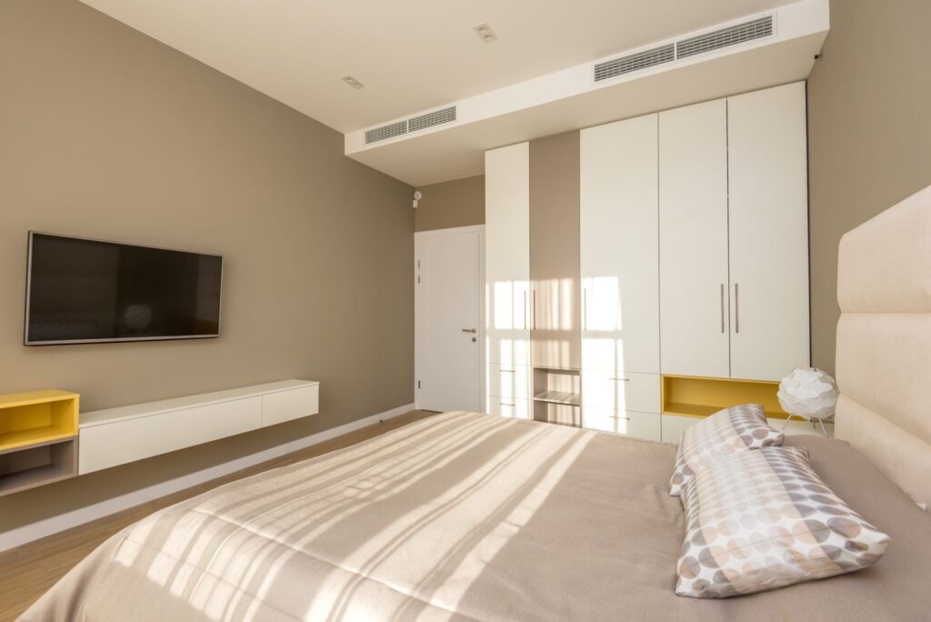
Dopamine decor isn’t an accident of taste, it’s a direct reaction to a decade of gray, beige, and greige dominating new-build interiors and rental flips alike. Where that palette aimed for safe and resale-friendly, dopamine decor aims for the opposite: rooms designed around what makes the people living in them feel good day to day, even if it never shows up on a real estate listing photo.
3. The Furniture Doing the Heavy Lifting
A handful of specific pieces keep surfacing across dopamine decor rooms, and they share a common thread: none of them are subtle. IKEA’s Sotenas armchair, sold in red and yellow for $299, anchors more than one styled room. An Artloge iridescent coffee table from Amazon, priced at $159, has been described as looking “like having a rainbow in the middle of your living room.” A $20 Andy Warhol-style blue cat print from Walmart adds graphic pop art energy for the price of a takeout order, and a $38 Sarag fluffy rug in yellow, purple, or rose red brings the same saturation down to floor level.
4. Lighting Gets the Same Treatment
Even functional pieces aren’t exempt from the color mandate. IKEA’s Grejsimojs LED table lamp, shaped like a dog and finished in blue, sells for $40 and doubles as both a light source and a small sculptural object, the kind of item that would have read as a novelty gift a few years ago and now reads as a legitimate lighting choice.
5. Pink, Yellow, Blue and Green Lead the Palette
Across the pieces driving the trend, four colors keep showing up more than any others: pink, yellow, blue, and green, often combined directly rather than used as single accent tones the way a neutral room might use one bold throw pillow. The clash itself is the point. Dopamine decor rooms tend to layer two or three of these colors against each other rather than picking one and building a monochrome scheme around it.
6. It’s a Low-Commitment Trend to Test
Part of what’s fueling the trend’s spread is how cheap it is to try. None of the pieces driving it require a renovation or even a repaint — an armchair, a rug, and a lamp can shift a room’s entire mood for under $400 combined, and every item can be swapped back out if the look doesn’t stick. That’s a meaningfully lower bar than the quiet-luxury trend it’s replacing, which often leaned on expensive, hard-to-reverse choices like natural stone counters or built-in cabinetry.
The Bigger Shift
What dopamine decor really represents is a pushback against designing a home primarily for resale value or Instagram neutrality. A red armchair and an iridescent coffee table won’t appeal to every future buyer walking through an open house, and that’s increasingly the point: homeowners are choosing rooms built around how they want to feel living in them right now, not how a stranger might feel touring them someday. Design writers covering the trend note it tends to work best applied in layers rather than all at once — a bold rug and one statement chair can carry an entire room, while every surface competing for attention at the same volume can tip a space from playful into overwhelming.