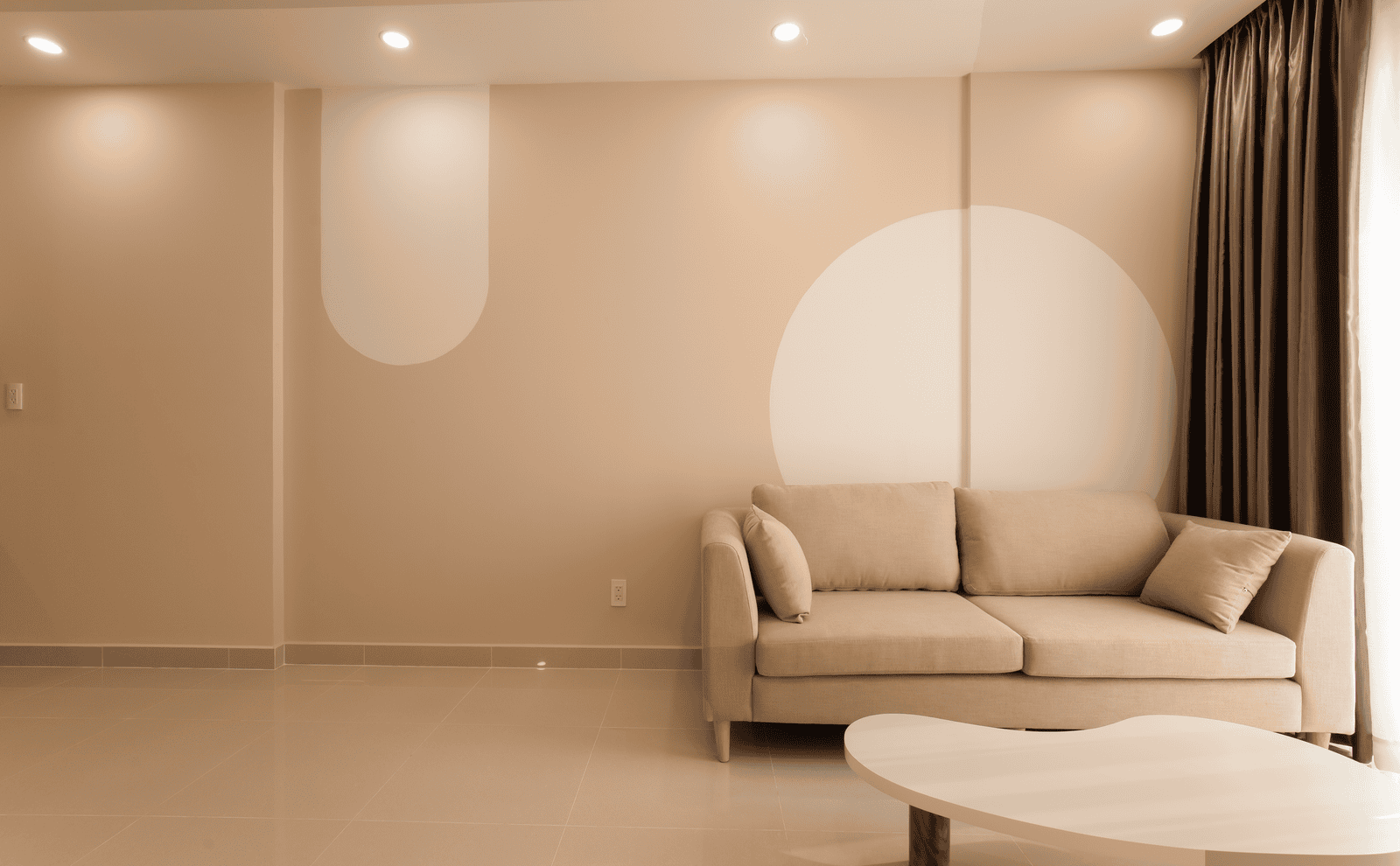
Sherwin-Williams spent last September crowning Universal Khaki its 2026 Color of the Year, calling it “a timeless, go-anywhere shade that brings a sense of grounded elegance to any space.” Homeowners who repainted living rooms and entryways in that warm neutral over the past year did so on the strength of one of the paint industry’s biggest annual endorsements. Yet the same company’s own HGTV Home collection for 2026 already lists reddish terracotta among its featured tones, and rival brands have gone further, formally naming their own burnt-orange and rust shades into official 2026 palettes. The shift isn’t a rumor circulating among design bloggers. It’s sitting in the brands’ own published color libraries, released within months of khaki’s big moment. Sue Wadden, Sherwin-Williams’ director of color marketing, described khaki as “more than just a neutral” when the company unveiled it, framing it as a foundation color meant to anchor a room rather than a passing accent, which makes its own sister brand’s pivot toward terracotta all the more telling about where the broader palette is already heading.
Two Brands, Two Terracotta Names, One Season
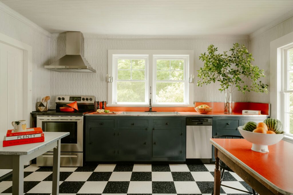
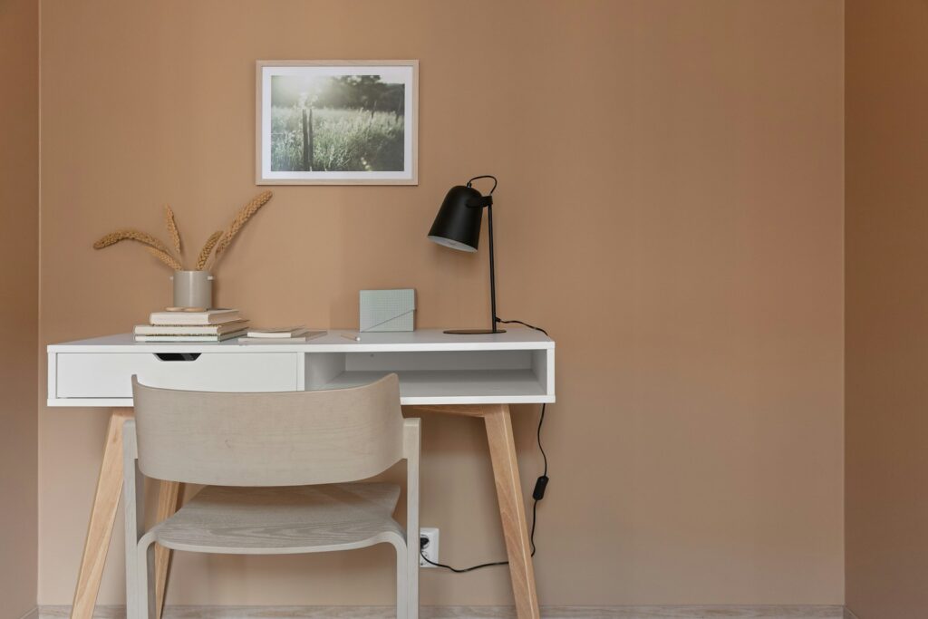
Behr Paint Company put a shade called Terracotta Urn into its 2026 palette, describing it as a hue that “fosters creativity and emotional warmth” and showcasing it in home office settings meant to feel “grounded and energizing.” Dunn-Edwards took a similar direction with Cedar Grove, a rich burnt coral-terracotta tone included among nine colors in its official 2026 Color Trends collection, which the brand frames as drawing inspiration from “sun-washed floral hues” and the outdoor spaces people already love. Neither company frames this as a rejection of warm neutrals outright, but the pattern is hard to miss: two major manufacturers built named, marketed colors around the same burnt-orange family in the same trend cycle that just celebrated khaki. The trade publication CoatingsTech, published by the American Coatings Association, tracked the broader 2026 season across manufacturers and found the dominant theme running through nearly every brand’s collection was earth-inspired, nature-centric color, with warm neutrals and the brown family gaining enough traction that Benjamin Moore’s own materials cited “a growing interest in the brown color family” as part of that shift. Terracotta and burnt coral sit squarely inside that same earth-toned family, which is likely why two separate companies reached for it in the same season rather than one brand testing the waters alone.
Why the Same Brand Can Champion Both Colors at Once
It sounds contradictory for Sherwin-Williams to name khaki its flagship shade while its own HGTV Home line features reddish terracotta in the very same year, but paint companies plan trend collections in layers rather than single bets. A Color of the Year functions as a marketing centerpiece meant to anchor a broad palette, while a brand’s full seasonal collection, the kind featured in HGTV Home’s lineup, tends to hedge across several directions at once so retailers and designers have options regardless of which way a given client leans. What’s notable this cycle is how quickly the warmer, more saturated terracotta family appeared inside that same collection, arriving in the identical release window as khaki’s coronation rather than a year or two behind it. Dunn-Edwards frames its own 2026 collection in almost sentimental terms, describing the palette as evoking “the feeling of watching an unhurried sunrise” rather than positioning it as a hard break from anything that came before, which is typical of how paint brands introduce a shift without ever explicitly telling customers their last purchase is already dated.
What This Means If You Painted Khaki Last Year
None of this makes a khaki wall wrong today, and Sherwin-Williams’ own marketing still stands behind it as a grounded, versatile neutral. But paint trend cycles move through brand collections faster than most homeowners repaint, and the companies’ own published palettes are the earliest signal available, well ahead of any magazine roundup, that a color’s cultural moment is narrowing. Terracotta and burnt sienna tones showing up as named, marketed colors across multiple manufacturers in the same season khaki peaked is exactly the kind of overlap that, historically, has preceded a broader swing toward warmer, richer tones in kitchens, home offices, and accent walls.
What the brands’ own 2026 libraries reveal, more than any single color, is how compressed these cycles have become: a shade can be crowned, marketed, and quietly nudged toward its successor within the very palette that made it famous, all inside a single calendar year.