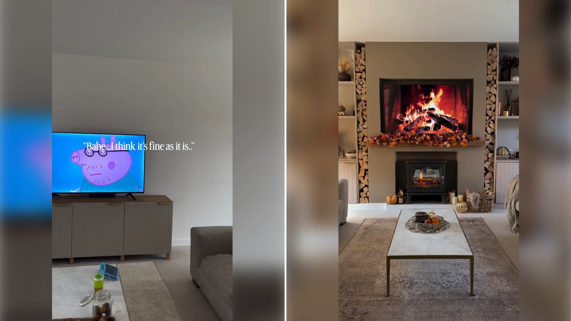
There’s a particular kind of magic trick that home content creators have mastered: the instant transition from total chaos to total calm. Creator @home_at_oldlands_drive pulled it off beautifully in a reel that cuts from a lived-in living room, toys scattered and a child parked in front of the TV, to a beautifully styled, warm autumn-toned space that looks plucked from a catalog. Her caption, “The reason we don’t listen…,” winks at the gap between the home she’s building and the home her family actually lives in day to day, and it’s that honesty, paired with the visual payoff, that makes the clip so watchable.
The “messy to magazine-ready” transition format has become one of the most dependable crowd-pleasers in the home content space, and it’s not hard to see why. It compresses hours of actual effort, choosing paint colors, hunting down the right media wall layout, arranging accessories just so, into a few seconds of satisfying visual payoff. But what sets this particular video apart is that the “before” isn’t staged mess for dramatic effect; it’s a genuinely familiar scene; a kid glued to a show, toys underfoot, the lived-in texture that defines most family living rooms most of the time. That juxtaposition between the real and the aspirational is exactly what keeps viewers scrolling back to rewatch.
Media walls, in particular, have become one of the defining home trends of the past few years, especially in new-build homes where a plain wall and a mounted TV used to be the default. Instead of hiding the television or pretending it doesn’t exist, creators like this one are leaning into the trend of building out a full architectural feature around it, often incorporating shelving, electric fireplaces, paneling, and layered lighting. It turns what used to be the most awkward focal point in a living room into the room’s centerpiece, something that photographs well and anchors the whole design.
Autumn styling adds another layer to why this video performs so well this time of year. There’s a seasonal rhythm to home content, with viewers eager for inspiration on how to transition their spaces from the brightness of summer into something cozier as the days shorten. Warm neutral tones, layered textiles, and soft ambient lighting all signal a kind of seasonal nesting instinct, the urge to make the inside of your home feel like a retreat as the weather outside turns. Capturing that mood in a living room that’s also, undeniably, a family space, makes the transformation feel aspirational but still attainable.
There’s also something quietly reassuring in the caption’s self-aware humor. “The reason we don’t listen” pokes fun at the gap between the Pinterest-perfect version of a room and the reality of raising kids in it, acknowledging that no matter how carefully a space is styled, a child’s presence will always pull it back toward chaos within minutes. Rather than hiding that tension, she leans into it, which is part of why so many parents find this kind of content relatable rather than intimidating. It’s not presented as a lifestyle you’re failing to achieve; it’s presented as a moment, captured between the mess and the next mess.
For parents feeling overwhelmed by the idea of a full living room renovation, videos like this one also offer something practical: a reminder that transformations don’t have to happen all at once. Media wall builds, in particular, lend themselves to phased projects, the framing one weekend, paint and trim the next, styling whenever time and budget allow. Seeing the finished product doesn’t mean a family skipped the mess of the process; it just means the mess happened off camera, over a longer stretch of time than the thirty-second reel suggests.
This genre of content also taps into something deeper about why home organization and design content resonates so strongly with parents specifically. A living room is rarely just a living room once kids enter the picture; it’s a playroom, a homework station, a snack zone, and occasionally a blanket fort, all layered on top of whatever design vision the parents originally had. Watching someone successfully build a space that can hold both the practical chaos of family life and a genuinely beautiful finished aesthetic offers a kind of hope that the two aren’t mutually exclusive.
It’s also worth noting how much these before-and-after transitions rely on strong editing and timing, which is its own skill. The whip-pan or match-cut transition that makes a messy room instantly become a styled one is deceptively hard to pull off well, requiring exact camera placement and lighting consistency between the two shots. Creators who’ve mastered this format, as @home_at_oldlands_drive clearly has, turn home improvement into genuine entertainment, not just a tutorial or a reveal, but a small piece of visual storytelling that rewards a rewatch.
At the end of the day, the appeal of this video isn’t really about the specific shade of paint or the exact styling choices on the shelves. It’s about the universal parenting truth tucked into the caption: you can build the home of your dreams, and your kids will still track mud, scatter toys, and plant themselves in front of the television in the middle of it, and somehow that’s not a failure of the design. It’s just what living in a home with children actually looks like, autumn styling and all.