Picking the perfect wall color can be a daunting task. With an array of shades available, it’s no surprise that many of us end up second-guessing our choices. We’ve all been there, standing in the paint aisle, debating between ‘Sunset Orange’ and ‘Coral Bliss’. But while some colors might seem enticing on a small swatch, they can often turn out to be a disaster when painted on a large wall. Remember, your wall color sets the mood for your room. So, it’s critical to choose a color that not only matches your furniture and decor but also creates a comfortable and inviting atmosphere. Based on my experience as a real estate agent, here are 13 wall colors that buyers often regret seeing.
1. Neon Green: A Shade Too Bold for Most Buyers
Neon green might have been popular in the 90’s, but today, it’s a color most homebuyers would prefer to avoid. This vibrant shade, although energizing, can be quite unsettling and distracting, especially in a living area or bedroom where people seek calm and relaxation.
2. Bright Yellow: An Overwhelming Burst of Sunshine
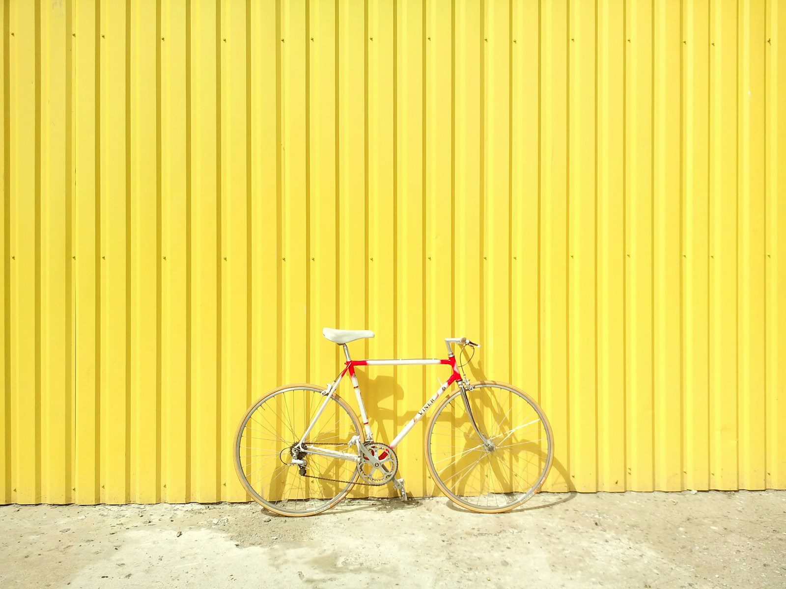
While a soft yellow can bring a warm, sunny vibe to a room, a bright, bold yellow can be quite overwhelming. It can create a sense of unrest and agitation, which is not what most people want when they come home after a long day.
3. Bubblegum Pink: A Color Not Just for Kids’ Rooms
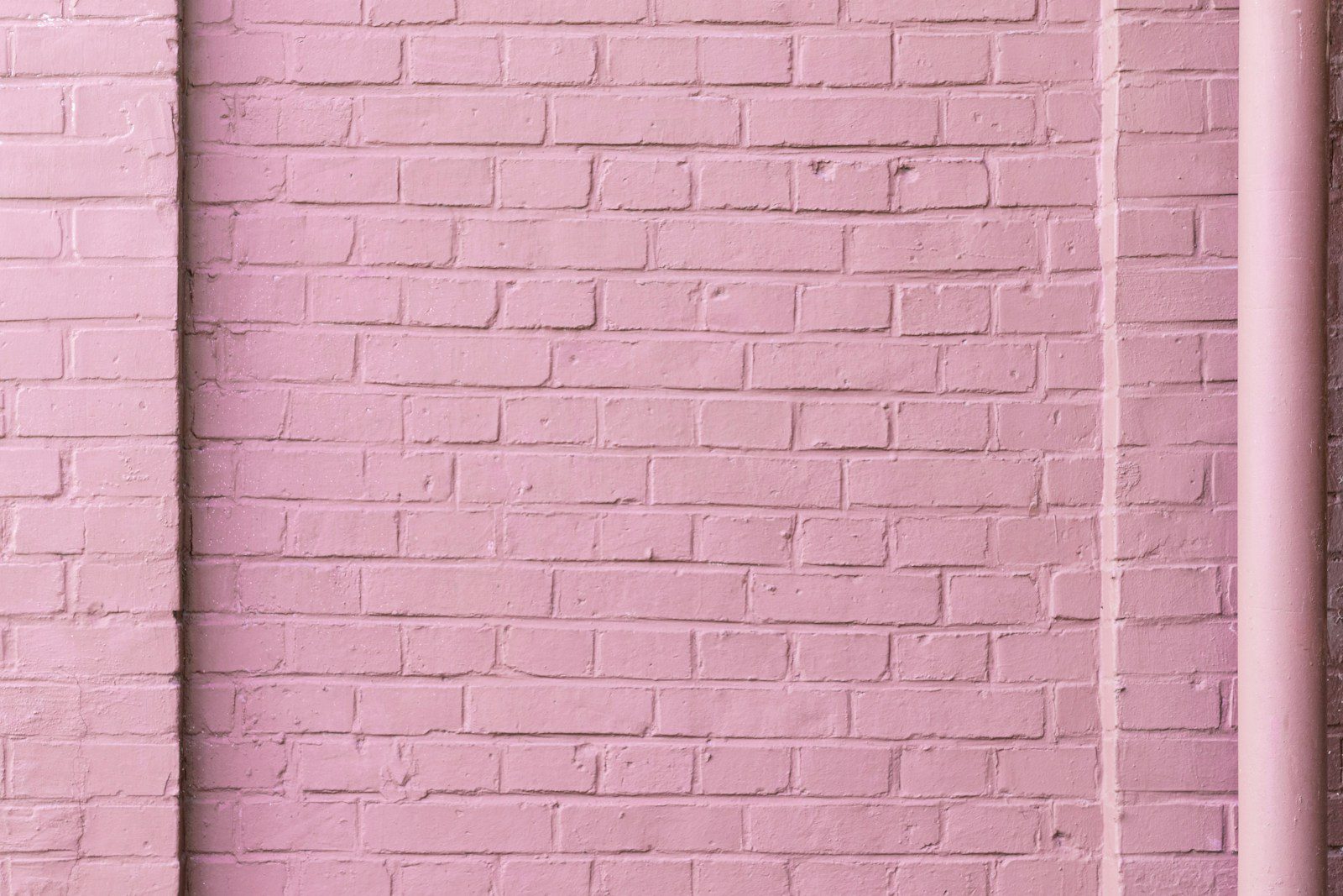
Bubblegum pink might be a favorite among young girls, but it’s not a color that appeals to everyone. It can be hard to pair with other colors and often comes off as too childish for a sophisticated home. So, unless you’re planning on converting the room into a nursery, you might want to steer clear of this color.
4. Orange Fizz: A Hue That Often Fizzles Out
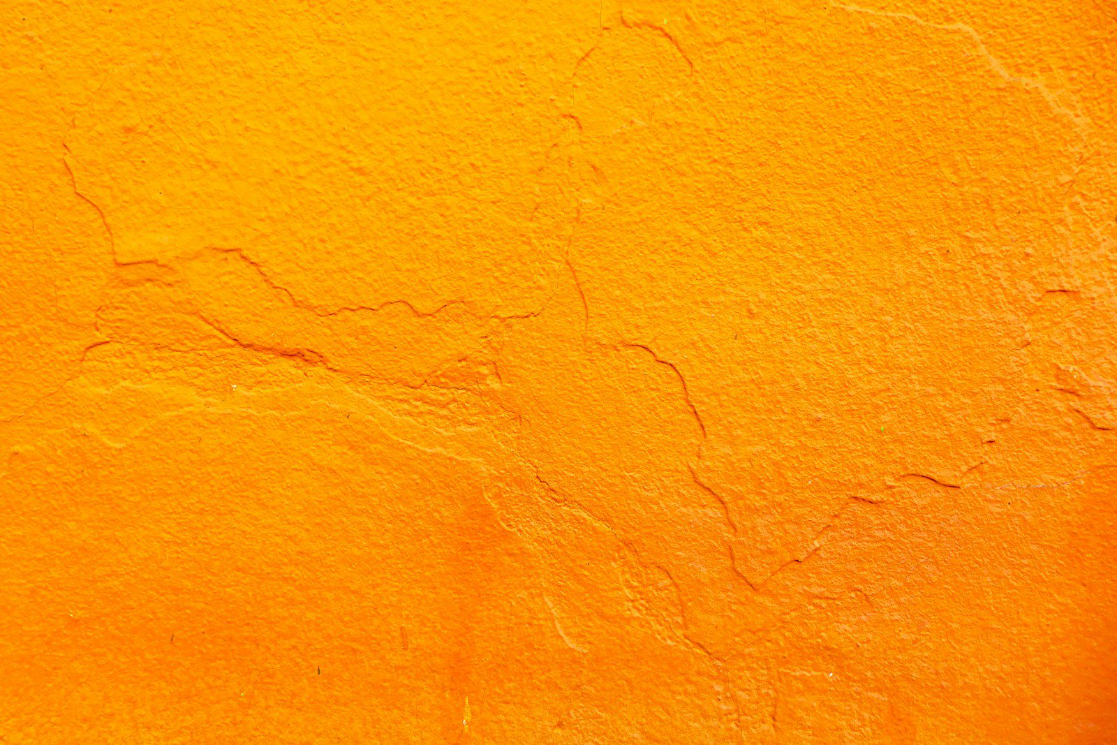
The bold and fiery nature of orange fizz can be quite polarizing. While some people might appreciate its energetic vibe, others might find it too intense and off-putting. It’s also a color that can be quite hard to match with other decor elements, leading many buyers to regret seeing it on walls.
5. Unsettling Red: An Intense Color that Evokes Strong Emotions
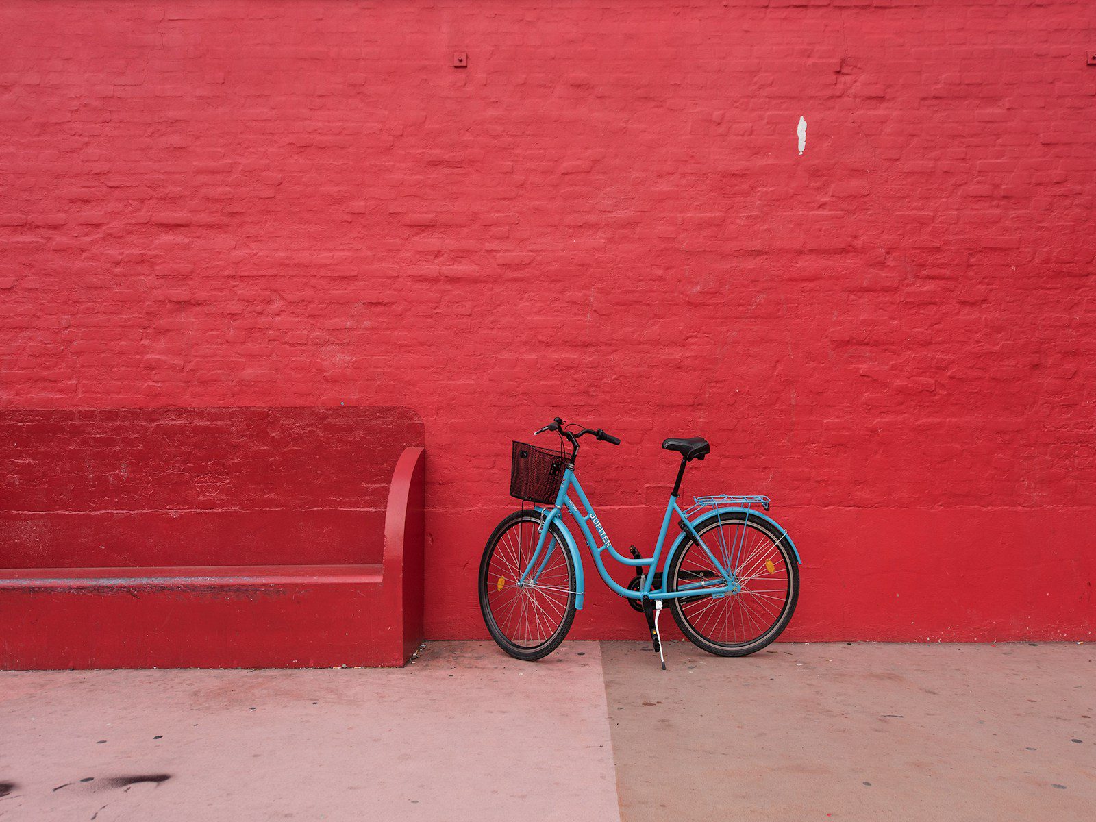
Red is a powerful color that can evoke strong emotions. While it can stimulate conversation and appetite in a dining room, it might not be the best choice for a bedroom or a living room. Moreover, a bright red can make a room feel smaller and more claustrophobic.
6. Royal Purple: A Dramatic Choice that Can Overwhelm
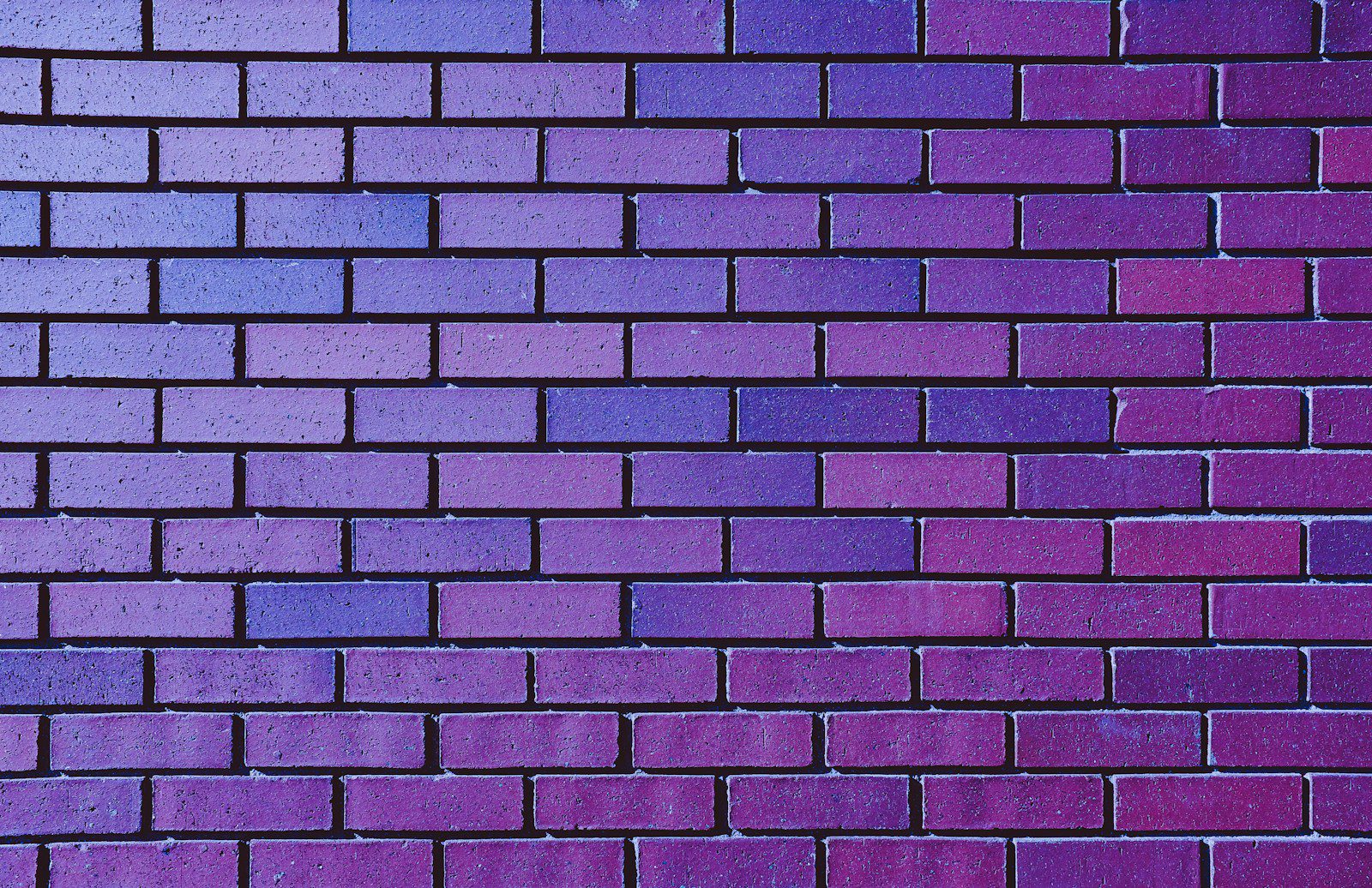
Royal Purple, with its royal and luxurious vibe, can make a bold statement in any room. However, it’s also a color that can easily overwhelm if not balanced properly with lighter tones. It’s not a color that appeals to everyone, and many homebuyers often regret seeing it on walls.
7. Dark Brown: A Color That Can Make Rooms Feel Smaller

Dark brown, while warm and comforting, can make a room feel smaller and more boxed in. It’s a color that works best in large, well-lit rooms with high ceilings. But in a small room, it can feel overwhelming and depressing.
8. Metallic Silver: A Futuristic Color that Can Feel Cold

Metallic silver, often associated with modern or futuristic designs, can make a room feel cold and uninviting. It’s a color that needs to be balanced with warm tones and textures to prevent it from feeling too stark or industrial.
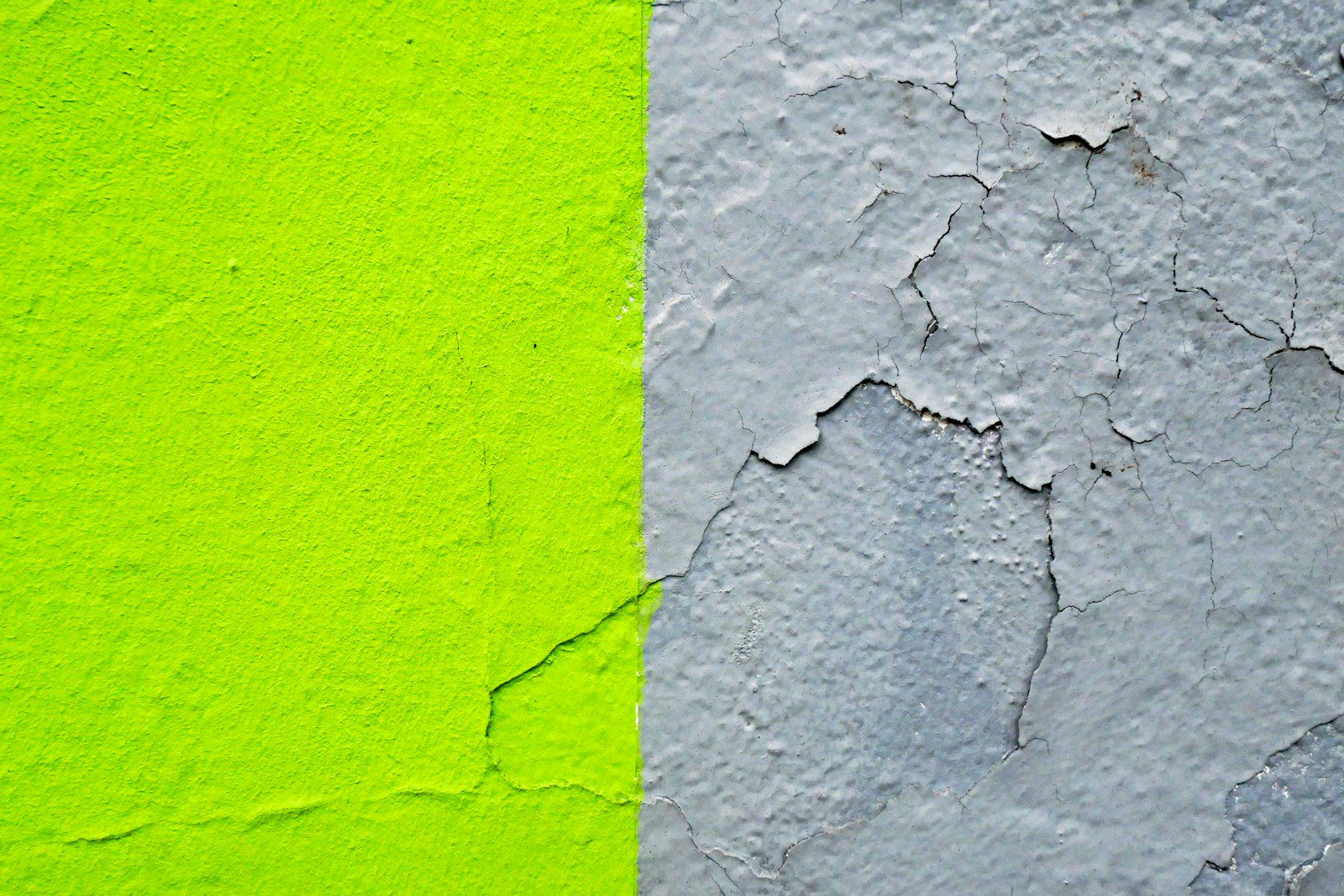
9. Lime Green: A Zesty Color that May Not Appeal to All
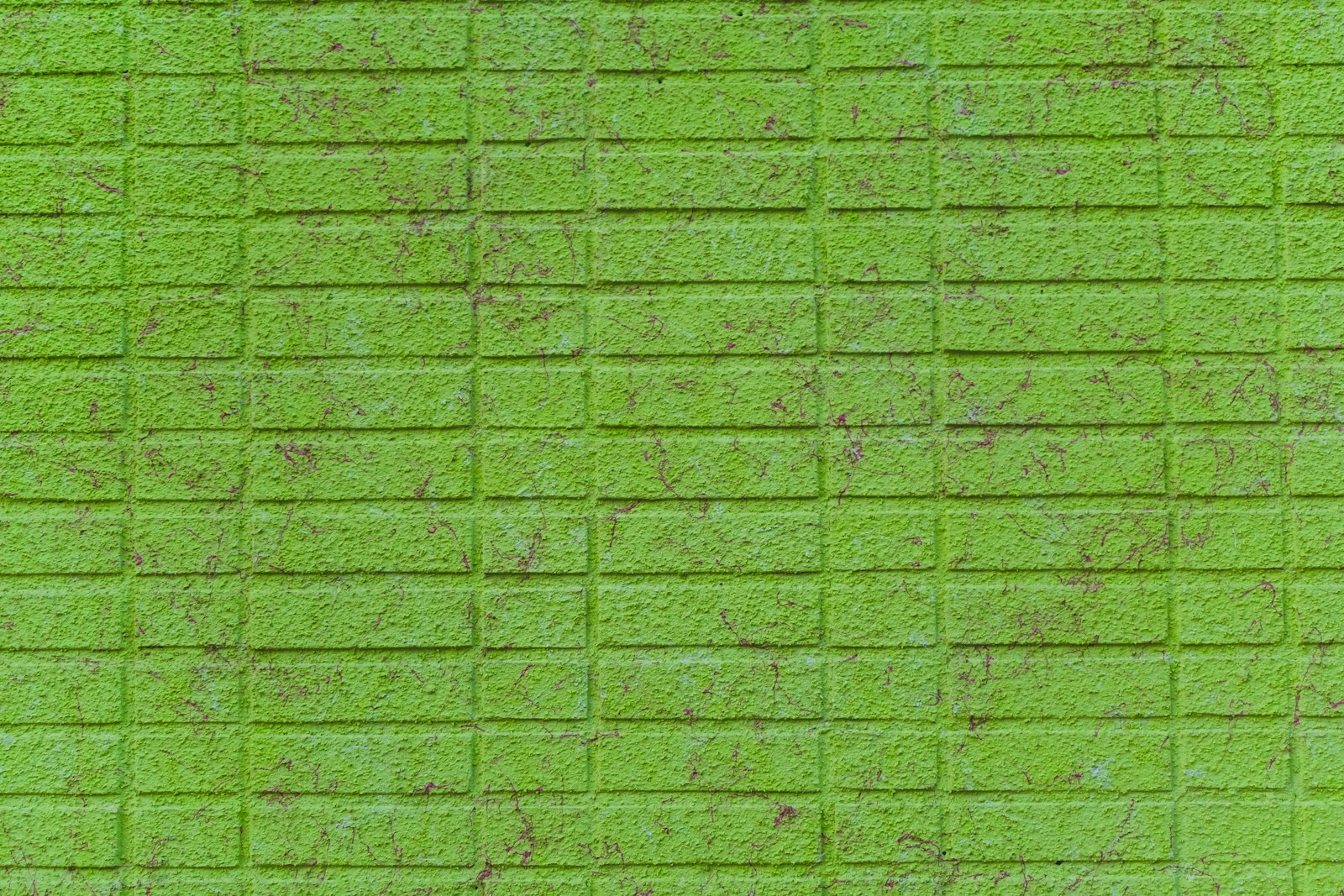
Lime green, a zesty and energetic color, can be quite polarizing. While some might appreciate its fresh and vibrant vibe, others might find it too bold and distracting. It’s a color that works best in small doses, like in accessories or accent walls.
10. Black Walls: A Bold Statement that Can Feel Gloomy
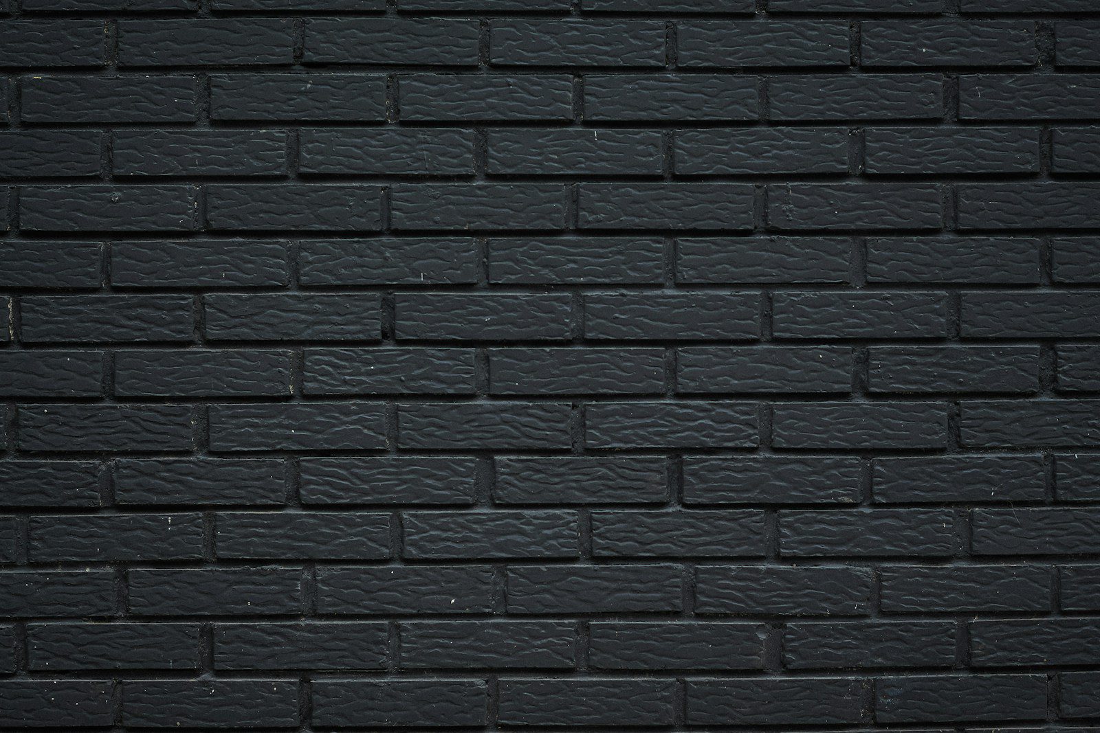
Black walls can make a powerful and dramatic statement. However, they can also make a room feel dark, gloomy, and closed in. Unless balanced with plenty of light and bright accents, black walls can be quite off-putting for many homebuyers.
11. Overly Bright White: A Stark Choice that Can Feel Sterile
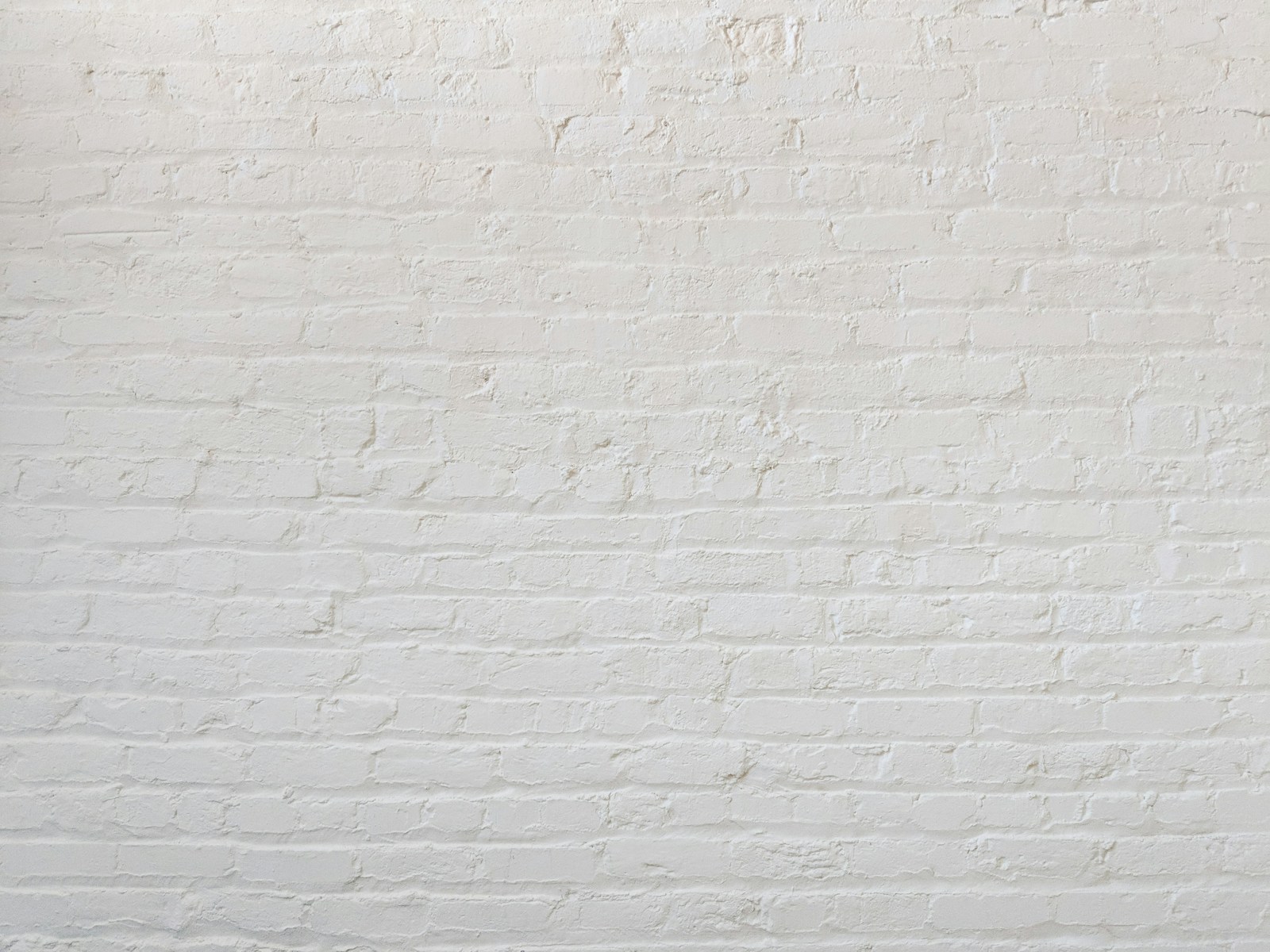
While white is often associated with cleanliness and simplicity, an overly bright white can feel stark and sterile. It can also make a room feel cold and uninviting. A softer, warmer white is often a better choice for creating a comfortable and cozy atmosphere.
12. Electric Blue: A Vibrant Color that May Not Be Everyone’s Taste
Electric blue is a vibrant and energizing color. However, it’s also a color that can easily overwhelm if not balanced properly with neutral tones. Plus, it’s not a color that appeals to everyone, making it a risky choice for walls.
13. Pea Soup Green: A Color That Often Leaves Buyers with a Bad Taste

Pea soup green, a dull and often unappealing color, is not a favorite among homebuyers. The color, often associated with sickness or unease, can make a room feel dreary and uninviting.
Remember, the color of your walls can greatly affect the mood and feel of your home. While some colors might seem tempting, they can often turn out to be a mistake. So, before you grab that paintbrush, take a moment to consider how your color choice might affect the overall appeal of your home. After all, you don’t want to end up with a color that leaves you or potential buyers with a bad taste. If you need a little help deciding, check out this report on the most popular paint colors for 2025 or watch this helpful video on choosing the right paint color. Happy painting!