Holiday decorating should make your home feel warm and intentional, not cluttered or chaotic. Designers say certain popular choices can instantly tip a space from festive to tacky, especially when they overwhelm architecture or ignore cohesion. By understanding which decorations professionals avoid, you can edit your display so it feels polished, personal, and still full of cheer.
1) Inflatable Lawn Ornaments
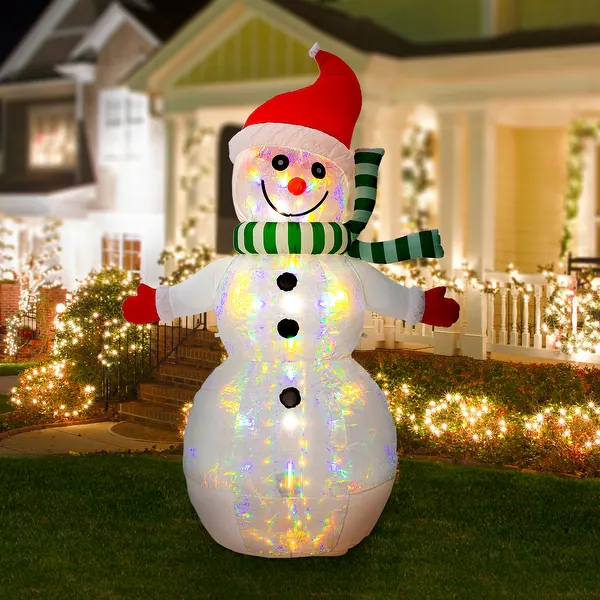
Inflatable lawn ornaments are one of the first items designers flag as visually overwhelming. Oversized, air-filled figures can dominate your yard, and experts note that these oversized, air-filled figures often distract from the home’s actual architecture. When a towering snowman or cartoon character becomes the focal point, the lines of your house, landscaping, and entryway lighting fade into the background. That imbalance is what makes the overall effect feel more like a roadside attraction than a thoughtfully decorated residence.
Instead of filling every patch of grass with inflatables, designers suggest choosing one focal piece or skipping them entirely in favor of greenery and subtle lighting. A single, well-placed figure can still delight kids without turning the yard into a plastic carnival. The broader trend in exterior decor leans toward restraint, so editing inflatables is a quick way to make your holiday curb appeal look more refined and timeless.
2) Mismatched Tree Ornaments

Mismatched or dated ornaments are another common culprit that designers say instantly cheapen a holiday tree. According to experts, collecting random, clashing baubles and hanging them all at once creates a cluttered, chaotic look. When every color, finish, and scale competes for attention, the tree loses any sense of rhythm or hierarchy. That visual noise is what makes even expensive ornaments read as low-end once they are all jumbled together.
Designers are not asking you to toss sentimental pieces, but they do recommend editing and grouping. You might reserve heirloom ornaments for a smaller secondary tree or cluster them by color so they feel intentional. Repeating finishes like glass, matte white, or brushed metal helps unify the display. The goal is cohesion, so your tree supports the room’s style instead of fighting it, which ultimately makes the entire space feel more elevated.
3) Glittery Plastic Wreaths
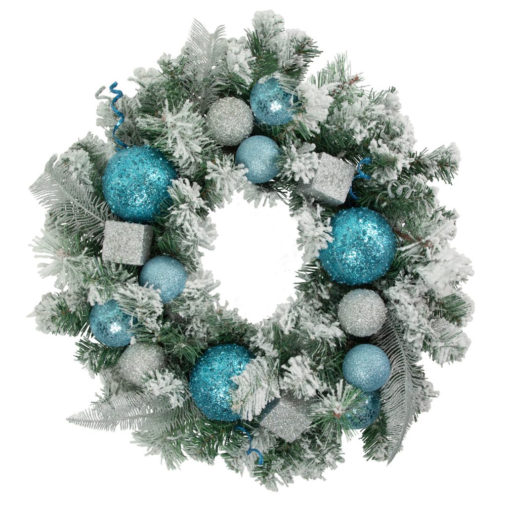
Glittery plastic wreaths are frequently cited as one of the fastest ways to make a front door look less sophisticated. Professionals advise against faux door hangings coated in cheap sparkle, noting that the finish often flakes, fades, and catches harsh light in unflattering ways. Because the wreath is usually the first thing guests see, a shiny, obviously synthetic design can set a tone that feels more discount aisle than welcoming entry.
Designers tend to favor natural or realistic greenery with restrained accents, such as a single velvet ribbon or a few pinecones. If you prefer faux for durability, look for wreaths with varied needle textures and minimal glitter so they mimic real foliage. This small upgrade has outsized impact, signaling that you care about details and helping your exterior decor read as classic rather than kitschy or disposable.
4) Excessive String Lights
Excessive string lights are another decoration that can quickly cross from charming to gaudy. Designers note that draping too many twinkling strands without pattern turns a home into a distracting light show instead of a cozy beacon. When every railing, window, and shrub is wrapped in competing colors and flash modes, the architecture disappears behind a wall of glare. That lack of structure is what makes the display feel more chaotic than celebratory.
To avoid this, professionals recommend choosing a single color temperature and mapping out where lights will highlight features like rooflines or trees. Symmetry and repetition are key, whether you outline just the eaves or frame the front door. By treating lights as a way to trace and enhance your home’s shape, you create a cohesive scene that feels intentional, which neighbors and guests tend to perceive as more tasteful and welcoming.
5) Roof-Mounted Santa Figures
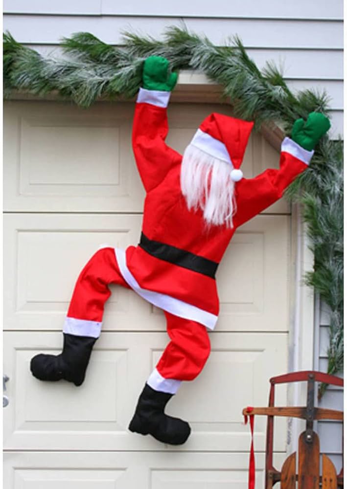
Roof-mounted Santa figures are often called out by designers as cartoonish and unrefined. Large plastic depictions are critiqued for making rooftops look like cartoon sets instead of elegant architectural features. When a bulky sleigh or oversized Santa dominates the roofline, it can clash with the scale of chimneys, dormers, and gables, making the entire facade feel less cohesive.
Designers suggest that if you love the idea of Santa, you bring the motif closer to eye level in a more subtle way, such as a small figurine on the porch or a print inside. Keeping the roofline cleaner allows your lighting and trim details to stand out. This shift reflects a broader move toward decor that feels integrated with the home’s structure, rather than perched awkwardly on top of it, which ultimately reads as more sophisticated.
6) Glowing Reindeer Statues
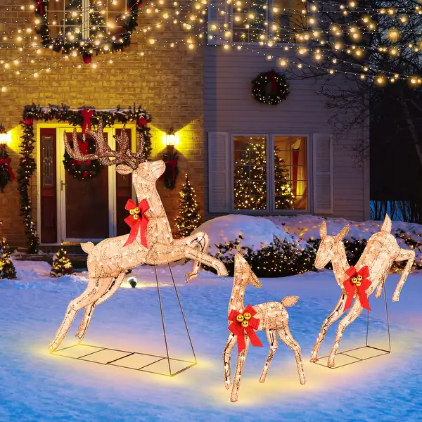
Glowing reindeer statues, especially those with bright red or neon noses, are another decoration designers deem tacky for their novelty overload. Experts highlight battery-powered deer with neon noses as overly whimsical and out of place in more refined settings. The intense glow and cartoonish features can feel more like a theme park prop than part of a cohesive landscape design.
Instead, professionals often recommend silhouettes or wire-frame deer in a single warm white tone, which nod to the motif without overwhelming it. Placing a small grouping near shrubs or trees can create a gentle vignette that supports, rather than competes with, other decor. This approach keeps the magic of reindeer imagery while aligning with a trend toward softer, more atmospheric outdoor lighting that flatters the home instead of shouting for attention.
7) Overabundant Tinsel
Overabundant tinsel is widely viewed by designers as a dated, messy element that drags down even otherwise stylish decor. The use of shiny strips everywhere tends to catch light in harsh, scattered ways, making trees and mantels look busy rather than bright. When tinsel covers branches, garlands, and even tabletops, it obscures the shapes and textures that give holiday greenery its charm.
Designers recommend limiting tinsel or skipping it in favor of more structured sparkle, such as glass ornaments or metallic ribbon. These alternatives reflect light in a more controlled way and are easier to style. Reducing tinsel also cuts down on shedding and cleanup, which matters for families and hosts. The result is a cleaner, more modern holiday look that still feels festive but does not rely on a single, high-glare material to carry the entire display.
8) Pre-Lit Artificial Garlands
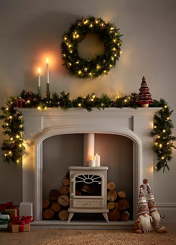
Pre-lit artificial garlands are another item professionals say often fails to deliver the warmth people expect. Designers disapprove of mass-produced, wired vines that lack natural texture and authenticity, noting that uniform plastic needles and visible wiring can look flat in photos and in person. When these garlands are draped over mantels or stair rails without additional styling, they can read as an afterthought rather than a considered design choice.
To elevate them, experts suggest layering in real clippings, ribbon, or ornaments to break up the monotony and hide hardware. Choosing garlands with mixed greenery and softer, warm white lights also helps. For homeowners, investing a bit of time in customizing pre-lit pieces can bridge the gap between convenience and style, ensuring the garland supports the room’s overall aesthetic instead of undermining it with an obviously artificial finish.
9) Indiscriminate Holiday Theme Mixing
Indiscriminate holiday theme mixing is a final, big-picture mistake that designers warn against. Blending every symbol from Santas to snowmen without cohesion creates visual chaos, even if each item is charming on its own. When nutcrackers, reindeer, candy canes, and multiple color schemes all compete in the same room, the eye has nowhere to rest, which makes the decor feel more like storage overflow than a curated display.
Professionals recommend choosing a guiding idea, such as “woodland,” “classic red and green,” or “metallic neutrals,” and editing pieces that do not fit. You can still rotate favorite items year to year, but limiting what is on display at one time helps your home feel intentional. This curated approach aligns with broader design trends that favor clarity and storytelling, ensuring your holiday decor looks collected and stylish rather than random or overly busy.
More from Decluttering Mom: