If you’re thinking about refreshing your home for 2025, one color is poised to take center stage in interior design next year. Designers predict that rich, warm tones, especially shades of deep burgundy, will dominate spaces across the board. Deep burgundy combines comfort and sophistication, making it a versatile choice that adds both intensity and elegance to any room.
This shift toward warmer colors is a response to years of minimalist, neutral palettes, giving you a chance to bring more personality and depth into your interiors. Alongside burgundy, you might notice other earthy hues gaining ground, but this deep, wine red shade is getting the spotlight for its ability to transform even small spaces with a bold yet comforting vibe.
The Color Dominating 2025 Interiors
Deep burgundy is shaping up to be the standout color of 2025, offering a blend of warmth and sophistication. It’s a shade that invites comfort and makes a strong statement without overwhelming your space. Designers are finding creative ways to bring this rich wine tone into various rooms, making it both versatile and timeless.
Why Deep Burgundy Takes the Spotlight
You’ll notice deep burgundy rising in popularity because it balances intensity with comfort. It’s more than just a color; it carries emotional weight, symbolizing individuality and elegance. After years dominated by minimalist and neutral palettes, this shade provides a refreshing contrast that feels both modern and classic.
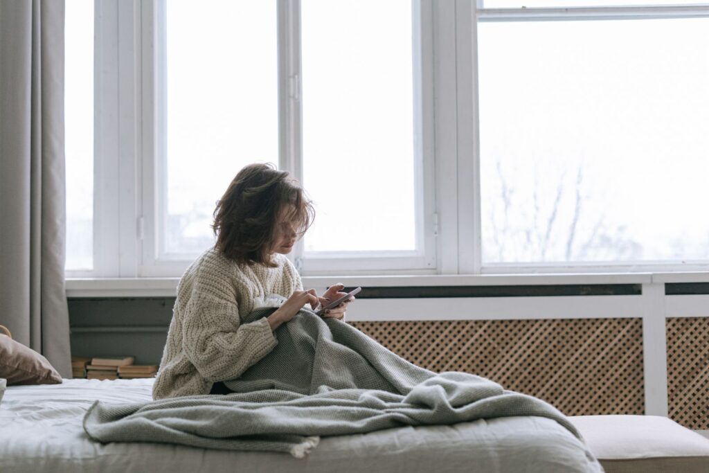
Designers appreciate how deep burgundy creates a cozy atmosphere while adding depth to interiors. It works well in smaller spaces too, where the color can amplify character without clutter. You might see this shade used in wall paint, upholstery, and statement furniture to achieve a luxurious yet inviting vibe.
How Designers Are Using This Statement Shade
In your home, deep burgundy can be used in bold or subtle ways to create visual interest. Designers often combine it with neutral tones or natural wood to balance its richness. For example, pairing burgundy walls with soft beige accents or warm wood flooring can soften the overall look while maintaining depth.
Another popular approach is to use deep burgundy as a focal point—think upholstered sofas, armchairs, or even cabinetry. This helps anchor the room and gives it a sophisticated feel without the need to overwhelm with color everywhere. Mixing burgundy with brass or gold finishes adds an extra layer of elegance that makes your space feel thoughtfully designed.
Trending Color Palettes Complementing 2025’s Top Hue
To bring depth and balance to the dominant 2025 interior color, designers are pairing it with selections that range from grounded natural shades to lively, playful accents. These palettes work together to create inviting, dynamic spaces that feel both fresh and thoughtfully curated.
Earthy Tones and Their Warm Appeal
Earthy tones are a natural match for 2025’s signature deep, warm hue. Shades like rich terracotta, olive green, and soft clay bring a grounding effect that complements the main color’s emotional warmth. These colors offer a soothing backdrop, perfect for creating cozy, serene interiors.
Incorporating earthy greens such as sage or muted moss helps evoke calm and connection to the outdoors. These colors work especially well on walls, textiles, or ceramic accents. You can also layer various earth tones to add texture and dimension, keeping your space feeling inviting without overwhelming it.
Echoes of Warm Neutrals in Modern Spaces
Warm neutrals like soft browns, creamy beiges, and muted taupes are making a strong statement alongside the top interior color this year. These tones amplify comfort and versatility, fitting seamlessly into both minimalist and richly layered designs.
Pantone’s 2025 Color of the Year echoes this trend with its inviting warmth, and shades like Mocha Mousse highlight how brown-based neutrals can be both modern and indulgent. Using these hues in upholstery or wall paint creates a soft, enveloping atmosphere that balances the intensity of bolder colors.
Bold Primary Colors and Playful Accents
If you want to add a vibrant twist, bold primary colors such as mustard yellow, bright cobalt blue, and fiery red bring playful energy without clashing. Mustard yellow, in particular, offers a warm pop that pairs well with deep reds and browns.
These accents work best in smaller doses—think cushions, artwork, or statement furniture pieces—to boost the mood without overpowering your room’s overall tone. Using bold primaries adds contrast and visual interest while keeping the space grounded in warmth and sophistication.
Natural Greens and Soothing Blues
These colors create a peaceful backdrop that feels both fresh and timeless. Their calming influence brings a touch of the outdoors inside, making any room feel balanced and inviting.
Sage and Olive Bringing Nature Indoors
Sage and olive are natural greens that add a subtle yet rich connection to nature. These colors work well on walls or in furniture pieces, giving your space an earthy warmth without overwhelming it.
Sage offers a soft, muted green that pairs beautifully with neutrals like cream or beige. Olive, on the other hand, is deeper and can add sophistication when used as an accent color. Both shades blend effortlessly with natural materials such as wood, linen, and stone, emphasizing a grounded, organic feel.
Using these greens can help you craft a cozy environment that’s both modern and serene. They’re especially great for living rooms, bedrooms, or any space where you want to encourage relaxation and calm.
Dusty Blue: The Calming Counterpart
Dusty blue sits perfectly between soft gray and blue, creating a soothing effect that’s great for restful spaces. It can cool down a room with a gentle, airy presence while maintaining enough color to feel lively.
This shade works well as a wall color or on textiles like curtains and bedding. It pairs nicely with warm neutrals such as taupe or soft browns, balancing warmth and coolness in your décor.
If you want a versatile tone that promotes calm without feeling too cold, dusty blue is an excellent choice. It’s ideal for bedrooms, bathrooms, or any room where you want to reduce stress and invite a sense of tranquility.
Blush Pink and Taupe: Soft Sophistication
Blush pink and taupe together create a refined and calming atmosphere in your home. These shades offer a mix of warmth and neutrality that works well in both bedrooms and living spaces. Their balanced tones can soften bold design choices while adding a subtle elegance.
Blush Pink’s Subtle Charm
Blush pink brings a gentle, romantic touch to interiors without overwhelming the room. Its soft, cool undertones create a soothing environment, making it perfect for spaces where you want to relax or unwind.
Because it pairs well with various textures and styles, blush pink fits easily into both modern and traditional decor. You can use it on walls, furniture, or accent pieces to add a hint of warmth and sophistication.
This shade is especially popular in bedrooms and living rooms, where you want a calm, inviting vibe. It works beautifully with creams, whites, and other neutrals, giving your space a fresh but cozy look.
Versatility of Taupe in 2025 Interiors
Taupe is a go-to neutral shade that offers flexibility without feeling bland. It ranges from warm greys to soft browns, which means you can find the exact tone to match your desired mood.
In 2025, taupe’s evolving palette allows you to mix it with blush pink for a balanced, earthy look. This combo adds depth while keeping your space grounded and warm.
Taupe’s adaptability also makes it easy to transition rooms between trends. Whether on walls, textiles, or decor, taupe complements bold colors and delicate pastels alike, giving you endless styling options.
Iconic Brands and Influencer Choices
When you’re choosing colors for your home, it helps to know what trusted brands and top interior designers are recommending. Their picks often set the tone for trends and can guide your decisions.
The Influence of farrow & ball on Color Selections
Farrow & Ball continues to be a major player in the paint industry, known for its rich, sophisticated colors. Their deep blues and moody tones, especially shades close to indigo, are capturing attention for 2025 interiors.
If you prefer a timeless look that pairs well with many styles, Farrow & Ball’s palette offers that flexibility. Their focus on earthy and classic blues can transform your space into something both calming and elegant. You’ll find these colors trending because they complement natural materials like wood and metals, making your rooms inviting yet stylish.
What Interior Designers Recommend
Top interior designers are strongly favoring indigo and deep, moody blues as a cornerstone color for 2025. They like how versatile it is—working equally well in different rooms, from kitchens to bedrooms. Designers highlight its ability to balance boldness without overwhelming the space.
Many pros suggest pairing indigo with softer neutrals or jewel tones for contrast. This mix adds depth while keeping rooms feeling balanced and cozy. For your home, following these recommendations means you can expect a look that feels modern yet timeless, with plenty of options for layering textures and finishes.
How to Use 2025’s Dominant Color in Your Space
To bring deep burgundy into your home effectively, consider where it can make the strongest impact without overwhelming the room. Combining this rich, warm tone with earthy hues and soft neutrals will keep your space feeling balanced and inviting. Thoughtful placement and textural contrast will let the color shine while enhancing the overall atmosphere.
Accent Walls and Feature Areas
Using deep burgundy as an accent wall is a great way to introduce the color without committing to full coverage. Choose a wall that draws attention naturally, such as behind a bed, fireplace, or in a dining room. This creates a cozy, sophisticated focal point.
To maximize the effect, pair the burgundy wall with warm neutral shades on the surrounding walls. Soft browns or beige tones help soften the intensity and provide a calm backdrop. You can also use the color on built-ins, shelving units, or smaller niches if you want a subtler statement.
Layering With Textures and Materials
Deep burgundy pairs beautifully with varied textures to create depth. Think velvet cushions, leather chairs, and matte ceramics in the same tone. These layers add richness while giving the color a tactile dimension.
Introduce natural materials like wood and stone to complement burgundy’s warmth. Dark, polished woods and lightly grained surfaces enhance an earthy sense that feels grounded. Layered textiles—wool throws, linen curtains, or woven rugs—bring softness and invite touch, balancing the boldness of the hue.
Mixing With Complementary Shades
To keep your space vibrant and harmonious, mix deep burgundy with earthy browns and warm neutrals. Colors like soft mocha and taupe create a natural flow that’s easy on the eyes. This palette adapts to various styles, from rustic to modern.
For contrast, you might add subtle touches of muted green or dusty pink, but avoid competing bright colors. Instead, let burgundy carry warmth and sophistication while supporting tones create a welcoming, cohesive environment. Using this approach will help your space feel intentional and stylish.