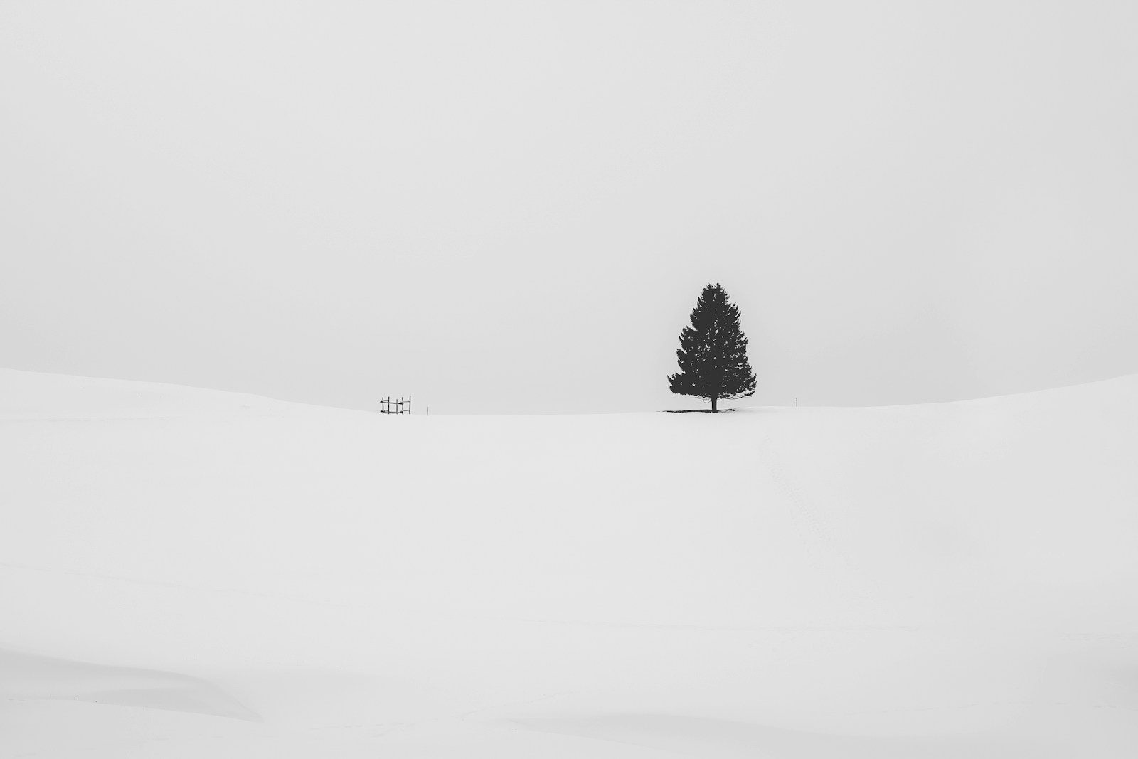
The global color-industrial complex has spoken, and the verdict for 2026 is in: the future is white, specifically a shade called Cloud Dancer. After years of peachy pinks and cozy browns, the decision to crown a billowy off-white as the next big thing has landed less like a trend forecast and more like a punchline.
I am not immune to a good neutral, but when the world is on fire, the oceans are rising, and our feeds are a nonstop doom-scroll, watching a color authority hold up “slightly warmer printer paper” as a cultural North Star feels, at best, like satire and, at worst, like denial with a swatch book.
From Peach Fuzz To Cloud Dancer: How We Washed Up In White
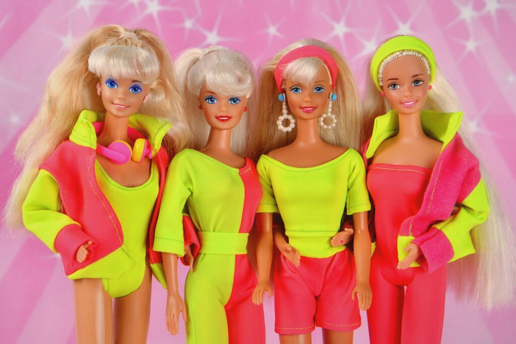
To understand how we arrived at Cloud Dancer, it helps to remember that Pantone has been soft-launching emotional support colors for years. Earlier in the decade, the company framed its annual pick as a soothing balm, with one selection described as a romantic hue tied to “velvety peaches” and “soft marabou feathers” meant to offer comfort amid global conflicts and challenging times, a mood captured in the description of the 2024 choice in Dec. Another breakdown of that same year’s palette framed the Pantone 2024 Color of the Year as PANTONE 13-1023 Peach Fuzz, a shade that branding experts said was selected to project a sense of calm and comfort, a positioning that marketing analysts unpacked in a piece on how the Pantone 2024 Color of the Year can influence branding.
The following year, the palette deepened into dessert territory. For 2025, PANTONE 17-1230 Mocha Mousse was introduced as the Pantone Color of the Year, described as a warm brown that promised “Everything you need to know” about a trend toward thoughtful indulgence and tactile comfort, a framing that a design guide summed up under the banner of Mocha Mousse. On Pantone’s own site, the 2025 program was pitched as “Capturing a Global Mood of Connection, Comfort, and Harmony,” with The Pantone Color of the Year described as an answer to our desire for comfort and a way to engage the design community around shared emotional themes, language that appears in the section titled “For 2025, the Pantone Color of the Year” on Capturing.
When “Billowy White” Meets A Very Non-Blank World
Cloud Dancer is supposed to be the next evolution of that comfort narrative, but the leap from mocha to near-blank has not gone smoothly. Pantone describes the 2026 pick as a “billowy” white that floats with a feeling of serenity, a choice that the company says emerged after its color experts “comb” the globe for signals and then distill them into a single hue, a process laid out in coverage of how Cloud Dancer was chosen. In Pantone’s telling, this lofty white is meant to be a calming influence, a kind of visual deep breath that clears the slate.
Outside the marketing copy, the reaction has been closer to a collective spit-take. One early critique noted that “Cloud Dancer is a lofty white that serves as a symbol of calming influence,” then promptly skewered the idea that a barely-there shade could carry that much emotional weight, a tension that a cultural column captured with the line “But let’s let Pantone try and sell it,” before unpacking the symbolism of Cloud Dancer. On social media, the jokes came even faster, with one Reddit thread titled “All the Sad Beige Designers will love Pantone’s Color of the Year” mocking the idea that Pantone just announced its color of the year and “it’s not a color,” describing Cloud Dancer as “aka white” and comparing it to the washed-out aesthetic of 2023, a reaction preserved in a post that begins “Pantone just announced its color of the the year” and riffs on Pantone.
When A Swatch Becomes A Symbol
The backlash is not just about boredom with neutrals, it is about what whiteness signifies in a year when politics and culture are already saturated with that word. One analysis argued that choosing a white shade as the global mood color is “tone deaf” at a time when the political significance of whiteness is at the center of debates across multiple countries, and noted that even a widely consulted English-language dictionary has been updating definitions around race and identity, a critique laid out in a piece that frames Pantone’s decision as More Stories about whiteness than about design. Another report summarized the uproar with the blunt assessment that the choice of a white shade called Cloud Dancer the 2026 color of the year has been slammed as “tone-deaf,” “dystopian” and even evocative of white supremacy, language that appears in a section labeled “Topline” describing how Pantone is facing backlash.
Even within the design world, there is a sense that the pendulum was already swinging away from washed-out palettes. A color forecast for a rival brand’s 2025 pick noted that “the trend in recent years has been for more muted colours so it felt like it was time for something more saturated,” a rationale used to justify a brighter hue under the banner of the Dulux Colour of the Year 2025. In other words, even the paint companies have clocked that people are tired of living inside a beige Instagram filter, which makes Pantone’s pivot to a nearly pure white feel less like leadership and more like arriving late to a party that already moved on to jewel tones.
The Cult Of Calm And The Color Of Nothing
Part of the problem is that Pantone keeps insisting its annual pick is a kind of emotional antidote to modern life, even as the choices start to look suspiciously like the same neutral couch in different lighting. A News Editor at LinkedIn who is an Ex-Washington Post staffer recently reminded readers that Each December, the Pantone Color Institute designates an “it” color and frames it as an “antidote” to our hyperconnected world, a ritual that has turned the forecast into a kind of yearly mood horoscope, as described in a piece about Each December. On Pantone’s own 2025 page, the company doubles down on that logic, describing The Pantone Color of the Year as a way of “Capturing a Global Mood of Connection, Comfort, and Harmony,” and presenting the program as a kind of group therapy session for designers, language that appears in the section titled “Capturing a Global Mood of Connection, Comfort, and Harmony” on The Pantone Color of the Year.
There is a certain poetry in trying to soothe a hyperconnected planet with a single swatch, but when that swatch is essentially the color of an untouched Google Doc, the symbolism starts to feel less like calm and more like erasure. I find myself wondering if the real mood of the moment is not Cloud Dancer at all, but the collective eye roll that greeted it, from the “sad beige” jokes to the critics who see something more dystopian in the choice. If color is supposed to reflect who we are, then a year defined by a shade that looks like nothing in particular may be the most honest forecast yet, a blank page that quietly admits we have no idea what comes next, even as we keep pretending that a new white will somehow make it all look better.
More from Decluttering Mom: