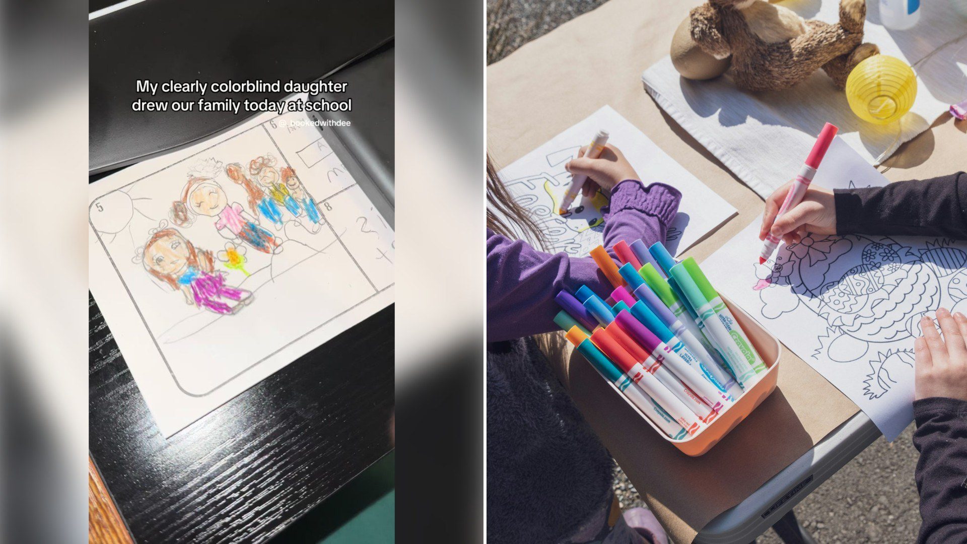
A creator posting under the handle _bookedwithdee held up a crayon drawing her daughter made at school depicting their family, and walked through, with real amusement, just how far off the colors were from anyone’s actual appearance — funny enough that she wondered out loud whether it might point to something more than artistic license.
@_bookedwithdee Taking her to get glasses tomorrow!!!! Honestly my husband genes didn’t even fight how light these kids are. And I’m a just a light skin Black women (not mixed) #childartist #artist #blackfamily #familycomedy #momlife
She narrates her genuine, real-time reaction to the artwork rather than presenting a polished take on it after the fact, which is part of what makes the moment feel so specific and real. It’s a small, tangible piece of kid art paired with an honest parental reaction, rather than a general observation about kids and art.
School-age color choices in artwork are usually just that — artistic freedom, limited crayon selection, or simply grabbing whatever was closest, rather than any indication of an actual vision difference. Still, the moment of double-taking at wildly mismatched colors and briefly wondering is a relatable one for a lot of parents who’ve held up their own kid’s confusing masterpiece at some point.
Whatever the explanation, the drawing itself is the real star here — a specific, funny, slightly baffling piece of kid art that most parents will recognize as exactly the kind of thing that ends up taped to a fridge for years regardless of accuracy.
Kid art has a well-earned reputation for being wildly, gloriously inaccurate, and most of the time the explanation really is as simple as it sounds. A school art station usually offers whatever crayons happen to be in the box that day, not a curated skin-tone palette, so a kid working quickly with whatever’s on hand will often grab green, purple, or bright orange without giving it a second thought. Accuracy isn’t really the goal at that age; finishing the picture in time to move on to the next activity usually is.
That said, the instinct to wonder about colorblindness isn’t an overreaction — it’s actually a reasonably common way parents first notice something might be worth checking. Red-green colorblindness, the most prevalent form, affects a meaningful share of boys in particular, and it often goes unnoticed for years simply because most everyday tasks don’t require distinguishing subtle color differences. A piece of artwork that swaps expected colors in a consistent, patterned way — reds and greens confused specifically, say, rather than random substitutions — can sometimes be the first visible clue a parent stumbles across entirely by accident.
The distinction between “creative color choice” and “actual color confusion” usually comes down to consistency and intention. A kid picking unusual colors because they like how they look, or because they’re experimenting, tends to vary their choices from one drawing to the next. A kid who consistently mixes up the same specific colors across multiple pieces of art, without noticing anything looks unusual, is giving a parent a more meaningful signal than a single one-off drawing ever could on its own.
Taking a kid to get their vision checked after a moment like this is a reasonable, low-stakes next step regardless of the eventual diagnosis. Even if colorblindness isn’t the explanation, a routine eye exam might catch something else entirely unrelated — nearsightedness, astigmatism, a need for glasses that has nothing to do with color perception at all. A slightly odd drawing turning into the nudge that finally gets a kid’s eyes checked is a genuinely useful outcome, whatever the drawing itself actually reveals.
There’s also something worth appreciating about how casually this kind of observation gets made, without any anxiety attached to it. Rather than spiraling into worry, the moment plays out as genuine curiosity and amusement first, with the practical next step — an eye exam — treated as simply the sensible thing to do, not a crisis to manage. That relaxed, matter-of-fact approach to a potential health question is a useful model for other parents who might otherwise talk themselves out of getting something checked simply because it doesn’t feel urgent enough to bother with.
Family portraits specifically tend to be a rich source of this kind of unintentional comedy, since kids drawing people they know well often produce results that bear only the loosest resemblance to reality — proportions exaggerated, features simplified down to a few basic shapes, colors chosen for reasons that make perfect sense inside a five-year-old’s head and absolutely no sense to anyone else looking at the finished product. That gap between intention and execution is exactly what makes kid art worth holding onto long after the specific moment that produced it has been forgotten.
By the time the appointment actually happens, the drawing itself will likely be taped to a fridge or tucked into a keepsake box regardless of what the eye exam turns up, because that’s generally what happens to this kind of art no matter how anatomically or chromatically accurate it turns out to be. The real value of the piece was never really about precision — it was about capturing exactly how a particular kid saw her own family at one specific, slightly baffling point in time.
There’s also a broader pattern worth noting in how often small, offhand moments like this one end up being the actual catalyst for a checkup that’s been sitting on a to-do list for months. Plenty of parents intend to schedule a vision screening eventually, without ever getting around to it until something concrete — a weird drawing, a squint at the TV, a teacher’s passing comment — turns an abstract intention into an actual appointment on the calendar. The drawing, in that sense, did more than produce a funny video; it did the one thing vague good intentions rarely manage on their own.