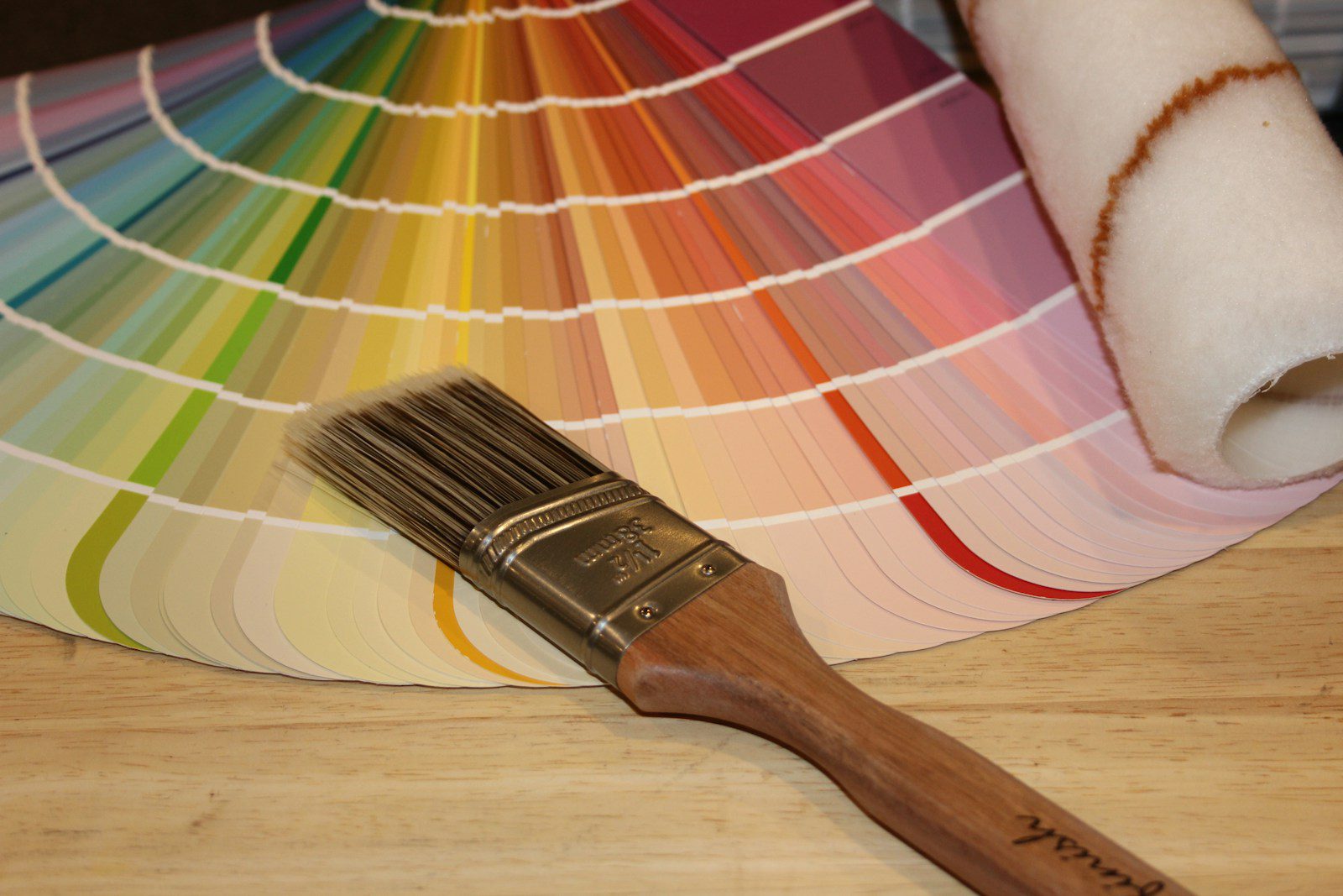
If you’ve been wondering which vintage colors are making waves in 2025, I’ve got the inside scoop. Designers are turning back to nostalgic shades that bring warmth and comfort to our living spaces. From rich burgundy to buttery yellows, these colors aren’t just trendy—they evoke feelings of coziness and timeless charm in every room. I’ve noticed how deep browns, coral peaches, and soft pinks are popping up everywhere, adding a grounded yet inviting vibe to interiors. These tones are all about creating spaces that feel personal and lived-in, perfect for anyone wanting a blend of history and modern comfort.
If you’re curious about how to bring these vintage hues into your home without feeling outdated, I’ll walk you through the most popular colors designers can’t stop using this year and how to style them in your space.

Why Vintage Colors Are Defining 2025’s Design Trends
Vintage colors are making a strong statement this year, not just because they look good but because they carry rich meanings and feelings. The appeal goes beyond aesthetics—these colors connect us to past eras while fitting perfectly into modern spaces. Designers and homeowners alike are embracing hues that feel warm, grounded, and timeless.
The Influence of Nostalgia and Retro Revival
I think nostalgia plays a huge role in why vintage colors are everywhere. As life speeds up, people want spaces that feel comforting and familiar. Colors like dusty blues, muted greens, and warm browns bring back memories of simpler times without feeling outdated.
This retro revival also ties into the popularity of styles like Art Deco and mid-century modern. These eras had distinctive, sophisticated palettes that convey elegance and personality. The resurgence of vintage color schemes is about capturing that charm with a modern twist—think rich eggplants paired with subtle yellows or terra-cottas softened by creams.
Interior Designers Leading the Vintage Movement
Interior designers I follow are championing vintage-inspired palettes because they offer depth and complexity. Instead of bright or stark colors, they lean toward muddied tones that create cozy, layered atmospheres. Designers like Ghislaine Viñas have been pushing colors such as truffle brown and eggplant purple, which resonate with a broad range of styles—from rustic to contemporary minimalism.
These professionals aren’t just using these hues for paint; they incorporate them in textiles, furniture, and even stone choices. This holistic approach helps to create spaces that feel authentic and personal, not just trendy. They’re redefining vintage as a living, evolving concept, not a fixed style from the past.
The End of Cold and Sterile Color Palettes
In 2025, I see a clear break from the cold and sterile palettes that dominated recent years. The shift toward vintage colors signals a desire for warmth and emotional connection in home design. People want their living spaces to feel inviting and reflective of their personalities.
Gone are the days of sharp grays and minimal whites as the main frameworks. Instead, we get rich, earthy hues like dusty reds and muddy pinks that offer more character and comfort. These colors soften interiors and foster a sense of calm grounded in nature and history, making homes feel genuinely lived-in and nurtured.
For more insights, see this detailed analysis of 2025’s color trends.
Key Vintage Color Palettes Shaping 2025
I’ve noticed a clear move toward colors that bring warmth and calm to spaces. These palettes blend gentle neutrals, rich browns, and soft pastels, offering both comfort and style. Each set has its own unique way of adding character without overwhelming a room.
Warm Neutrals: Taupe, Beige, and Wheatfield Shades
Warm neutrals like taupe, beige, and wheatfield shades are making a strong comeback. These colors create inviting atmospheres by adding a subtle glow that works well across different lightings. Taupe, especially, balances warmth with a hint of gray, making it versatile for both modern and classic designs.
I love using these shades as a base because they pair beautifully with bolder accents or stay understated for a calming effect. Their earthy warmth provides a cozy backdrop without being dull. These colors work well on walls, textiles, or furniture, keeping spaces feeling natural yet refreshed.
Earthy Browns and Brown Tones in Modern Spaces
Earthy browns, including dark brown and warmer brown tones, are key players this year. These colors add depth and grounding energy to interiors. Dark brown, in particular, is sophisticated and provides a solid foundation when layered with lighter or contrasting shades.
In my experience, combining browns with softer accents like powdery pink or muted orange creates a well-rounded look. The rich undertones of brown tones evoke a vintage feeling but are updated to fit modern aesthetics. Using them on woodwork, cabinetry, or accent walls enhances the cozy, nostalgic vibe without sacrificing refinement.
Pastel Palettes for a Soft Nostalgic Touch
Soft pastel palettes are popping up everywhere for a gentle nod to nostalgia. These colors, such as muted pinks and blues, offer warmth and calm without the sharpness of more saturated hues. I find pastels particularly effective when used generously, almost as dominant tones in a room.
They work as inviting alternatives to traditional neutrals, creating rooms that feel both airy and comforting. The dusky pinks, with subtle brown undertones, are especially popular as “new neutrals” that warm up a space. Pairing pastels with textured fabrics or natural materials completes the look, making it both fresh and timeless.
Learn more about how these color palettes blend warmth and retro style in the vintage-inspired 2025 color trends.
Statement Colors and Signature Accents
I’ve noticed that 2025 is all about rich, bold colors paired with natural, grounding elements. Designers are moving toward deeper hues that make a strong impression, while also embracing familiar materials and decades-old styles that bring personality back into a space.
The Resurgence of Jewel Tones
Jewel tones like emerald green, sapphire blue, and amethyst purple have made a powerful comeback. These colors add instant depth and luxury, perfect for people who want more than subtle neutrals.
They work beautifully on walls, cabinetry, and even furniture upholstery, creating eye-catching focal points without overwhelming the room.
Jewel tones also blend well with vintage-inspired design, mixing modern elegance with a sense of history. The shift away from pale pastels and stark whites means jewel colors are a go-to when you want a statement without sacrificing sophistication.
Brown Furniture as a Design Focal Point
Brown furniture is no longer just a background player; it’s coming front and center in design. Warm, earthy browns in leather, wood, and vinyl add rich texture and weight to rooms.
This furniture acts as a neutral base that complements bold wall colors like jewel tones or muted vintage hues such as olive or mustard. I find that brown pieces help balance spaces with strong color saturation, keeping the room grounded and approachable.
Their classic look fits perfectly with the ongoing popularity of vintage style, bringing in an element of both comfort and timelessness.
Art Deco and Retro Influences on Color Choices
There’s a clear influence from Art Deco and mid-century styles shaping color trends. The geometry and glamour of Art Deco inspire designers to choose colors with metallic undertones, like gold-infused green or bronze-tinged blue.
Retro colors like burnt orange and mustard have softened but still appear as playful accents rather than overpowering choices. These influences pair well with jewel tones and brown furniture, creating a layered, curated feel that is both nostalgic and fresh.
The mix of these styles allows color to tell a story, tying the present back to design history without feeling dated.
Expert Voices: Brigette Romanek and Trend Predictions
Brigette Romanek, a key voice in historical and vintage design, highlights how color trends in 2025 focus on emotional warmth and authenticity. She points out that many are drawn to colors that evoke calm yet intrigue, like deep moss greens and rich browns.
Romanek sees the continued rise of jewel tones paired with natural materials as a way to balance bold aesthetics with comfort.
She predicts these statement colors will be integrated thoughtfully, often layered with neutral tones to create spaces that feel both lively and livable, reflecting a deeper appreciation for heritage and craftsmanship. More insights can be found at vintage paint colors making a comeback.
How to Incorporate Vintage Colors Into Your Home
Vintage colors add warmth and personality, making spaces feel inviting yet stylish. Using these tones thoughtfully helps maintain a fresh feel while paying homage to classic palettes.
Mixing Minimalism with Retro Styles
I find that combining minimalist design with retro colors creates a beautiful balance. Use a muted color palette like soft mustard, olive green, or dusty rose as accent walls or in textiles. Keep furniture and decor simple and clean-lined to avoid visual clutter.
For example, a sleek white sofa paired with burnt orange throw pillows brings vintage flair without overwhelming the room. I also like to use geometric patterns subtly in rugs or cushions to hint at retro style while keeping overall simplicity. This approach respects the calmness of minimalism but lets vintage colors shine.
Updating with Vintage-Inspired Accessories
Small changes go a long way when adding vintage colors. I add retro hues through lamps, picture frames, or ceramics. These pieces anchor the room’s color story without committing to large-scale changes.
Look for vintage-inspired glassware in amber or emerald tones, or find throw blankets and cushions in classic plaids and florals. Lighting fixtures with brass or aged metal finishes complement these color choices perfectly.
Swapping out standard cabinet knobs or hardware for colored glass or matte brass versions adds a vintage touch in unexpected places. Accessories let me experiment boldly and switch styles easily.
Balancing Old and New in Contemporary Design
Blending vintage colors with modern design means creating contrast while preserving harmony. I use vintage paints like sage green or muted teal on one feature wall or in kitchen cabinets, paired with modern, glossy finishes elsewhere.
Introducing a statement vintage piece, such as a mid-century chair in a bold retro shade, contrasts nicely with neutral modern sofas or shelving. Mixing materials helps too—think combining velvet cushions in mustard yellow with sleek metal or glass surfaces.
This balance ensures vintage colors enrich the space without feeling dated or out of place. It’s about thoughtful pairing and maintaining a cohesive palette throughout.
For more ideas on mixing styles and vintage color tips, see this guide on bringing vintage design to your modern home.

