Sherwin-Williams has named Universal Khaki SW 6150 its 2026 Color of the Year, according to the company’s own joint announcement with HGTV Home by Sherwin-Williams — and the pick matters less as a single paint chip than as an official signal that a decade of gray and greige walls is losing its grip on American homes. When the industry’s most-watched annual color call shifts from a cool, muted neutral to a warm, yellow-undertone one, it’s not just a trend piece; it’s a company with warehouses full of paint deciding where the next few years of demand are actually headed.
What Universal Khaki Actually Looks Like
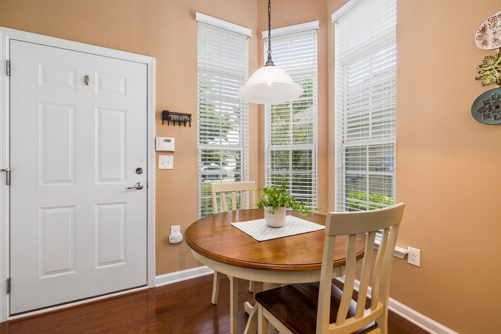
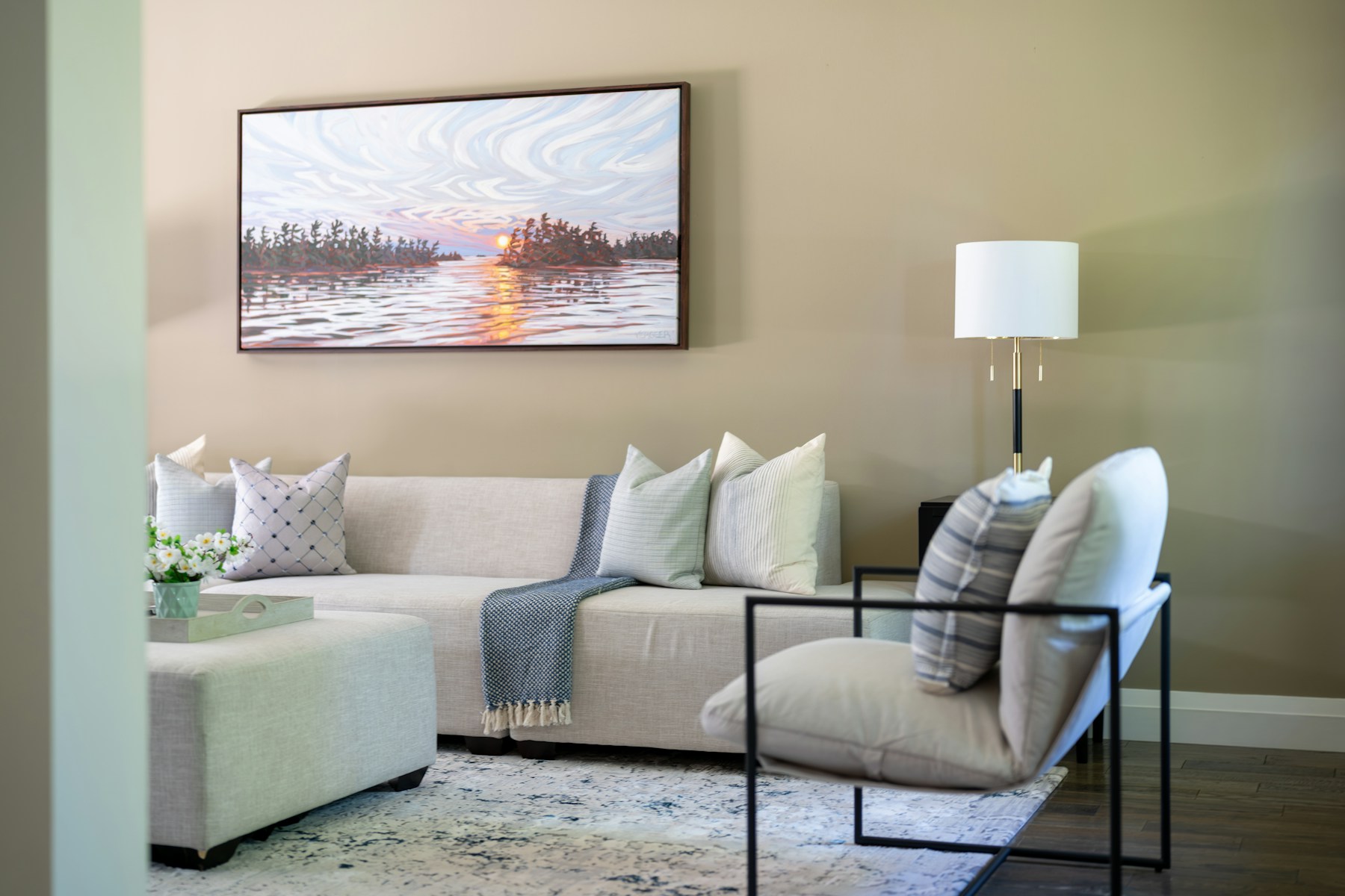
Sherwin-Williams describes the shade as a mid-tone neutral with a slight yellow undertone, calling it, in the company’s own color page, “an essential neutral selected by our color experts for its beautiful balance of livability and longevity” that captures “the satisfying simplicity at the core of contemporary comfort.” That’s a meaningfully different pitch than the cool, blue-gray “greige” shades that dominated Color of the Year picks and builder-grade palettes for roughly the past decade — this is a neutral built to read warm in every kind of light, not one engineered to disappear into a cool, minimalist backdrop.
Why Sherwin-Williams Is Calling It “Go-Anywhere”
Sue Wadden, the company’s director of color marketing, framed the pick as a versatility play rather than a bold style statement, saying in Sherwin-Williams’ own release: “Khaki is more than just a neutral — it’s a timeless, go-anywhere shade that brings a sense of grounded elegance to any space.” On the company’s color page, Wadden goes further, noting the shade “works with natural finishes, crisp whites or bold pops of color” — language explicitly designed to position Universal Khaki as a background color flexible enough to anchor very different design styles, from farmhouse to modern to traditional, rather than a statement color tied to one aesthetic moment.
The “Honest Essentials” Framing Signals a Broader Shift
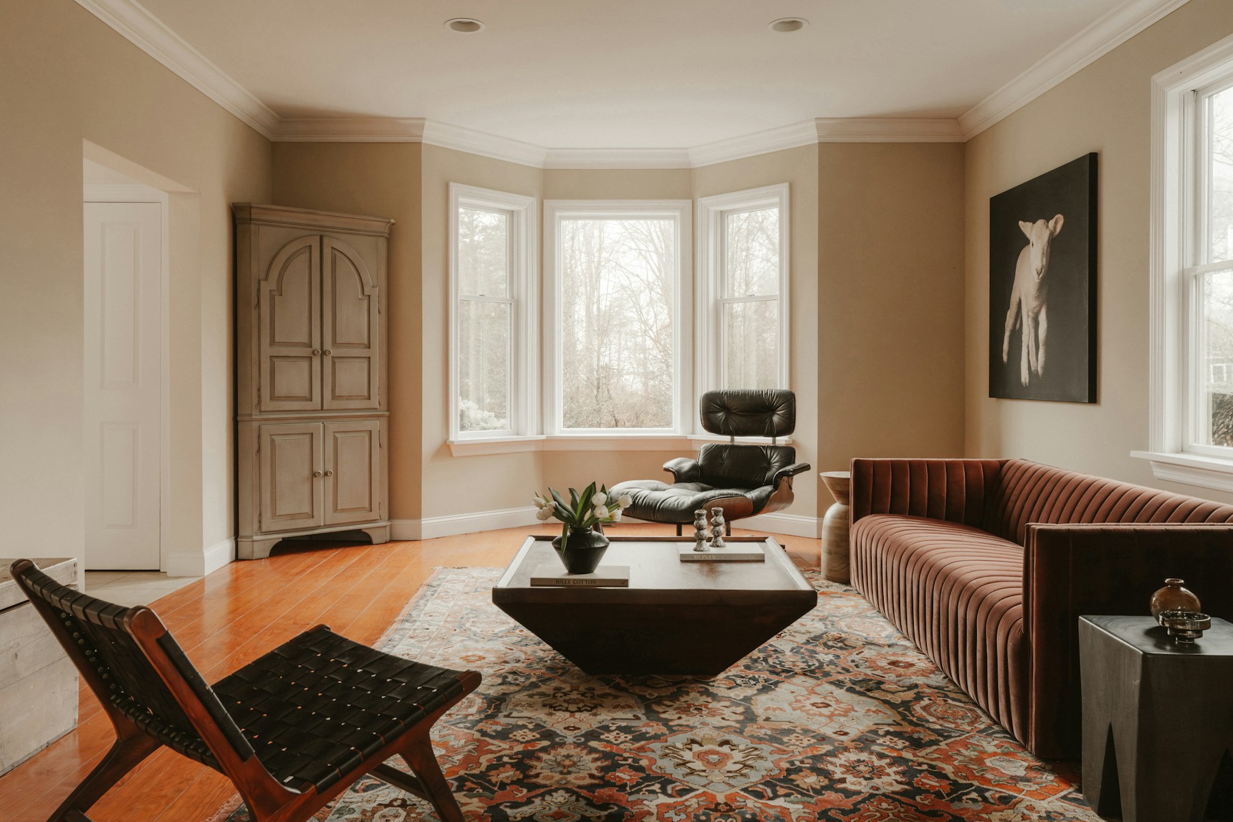
Ashley Banbury, color marketing manager for HGTV Home by Sherwin-Williams, tied the pick to a larger design philosophy the two brands are calling “Honest Essentials,” stating in the same release that “Honest Essentials represents a new era where purpose and simplicity are the ultimate luxuries.” That phrase, paired with a warm neutral instead of another cool gray, reads as a deliberate pivot away from the stark, hyper-minimal palettes that defined the greige era and toward something the brand is positioning as warmer, more livable, and less trend-chasing — even though it’s arriving through the industry’s single biggest annual trend announcement.
Why This Marks an Ending, Not Just a New Option
Color of the Year announcements function differently than a typical new paint launch. They’re built to set the tone for an entire year of showroom displays, builder-grade default palettes, and home renovation content, which is why the industry treats the pick as a bellwether rather than one option among thousands. Sherwin-Williams sells to homeowners, but its color forecasting also feeds directly into homebuilder specifications and rental-property repaint standards — the two channels responsible for a huge share of the gray and greige walls that became a default, almost invisible choice in new construction throughout the 2010s and early 2020s. A shift at that level doesn’t erase gray from existing homes overnight, but it does mean the “safe neutral” builders and flippers reach for by default is quietly changing character.
What Homeowners Should Take From the Pick
For anyone weighing a repaint this year, the practical takeaway isn’t that gray is suddenly wrong — it’s that warm neutrals are being positioned, by the company with arguably the widest reach in American paint choices, as the safer long-term bet rather than the more daring one. A homeowner choosing between a cool greige and a warm khaki for a whole-house neutral is no longer picking between “trendy” and “safe”; according to Sherwin-Williams’ own framing, the warm option is now the one being marketed as timeless. That reversal, more than the specific hex value of SW 6150, is the real story behind this year’s pick — a color company publicly betting that the next decade of neutral walls will look and feel different from the last one, warmer underfoot and less clinical on the eye, even before a single gallon of Universal Khaki has gone up on a living room wall.